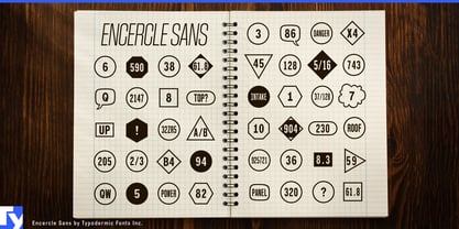
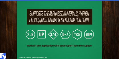
A numbered callout is easy to draw once. It becomes tedious when a diagram needs thirty of them, the numbering changes, several shapes are required, and every circle or box has to stay centred around its label. Encercle Sans turns that repetitive graphics job into typography, keeping framed identifiers editable as text instead of as collections of manually constructed objects.
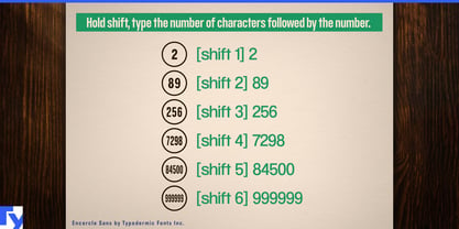
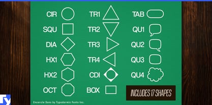
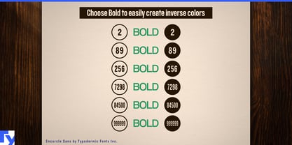
Encercle Sans can frame labels of up to six characters using 17 different shapes, allowing the same system to handle numbers, letters and short codes. Circles can identify components, boxes can carry part references, while diamonds, polygons and directional forms can distinguish other categories. Inverse versions provide another level of contrast when selected markers need to stand out.
Instruction graphics are a natural use. Assembly manuals, exploded product diagrams, repair guides and installation sheets routinely need part numbers, step markers, warning references and component codes. If item 18 becomes item 27, the label can simply be edited rather than rebuilt and recentered.
Museums, exhibitions and visitor information present the same problem at a larger scale. Exhibit numbers, audio-guide references, gallery-map markers, room codes and floor-plan legends may appear across signs, brochures and diagrams. Festival maps, conference floor plans, trade-show guides, campus maps and hiking guides similarly depend on compact identifiers that connect locations to a legend.
The system also suits infographics, research figures, educational material and tabletop-game diagrams. Annotated photographs, process graphics, scientific figures, numbered objectives and map references can use different frame shapes while remaining part of one consistent visual language.
Encercle Sans grew from a practical request from an architect who wanted a simpler framed-number system. That production-minded origin remains its purpose: making callouts easier to create, revise and keep consistent. Its automatic framing depends on typographic feature support, so applications without the necessary substitution support may require the labels to be generated elsewhere and imported.