■About Festoso
Eccentric and Diverse Multilingual Typeface
Festoso 9 Weights Font Family
Designed as a Companion to “Hommaru-Kana”
As Festoso was created as the Latin companion to Hommaru-Kana, it naturally reflects the distinctive characteristics of Honmaru-Kana in its design.
While our general policy is to design companion Latin scripts in a relatively orthodox style, Festoso was developed as a script typeface to maintain consistency with the playful and expressive nature of Hommaru-Kana.
This typeface is based on the everyday handwriting of our type designer, Kazuo Kanai.
It features a uniquely rounded form with subtle traces of brush lettering.
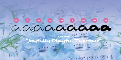
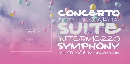
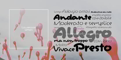
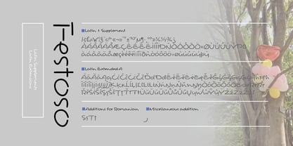
The family consists of nine weights, ranging from Extra Light (EL) to Heavy (H).
■Characteristics of Festoso
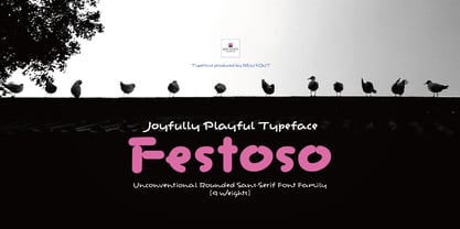
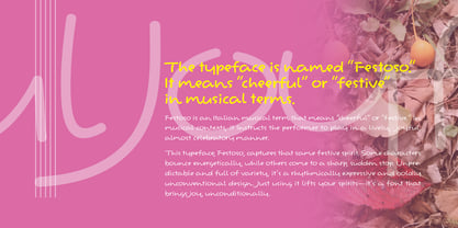
The typeface is named “Festoso.”
Festoso is an Italian musical term that means “cheerful” or “festive.” In musical contexts, it instructs the performer to play in a lively, joyful, almost celebratory manner.
This typeface, Festoso, captures that same festive spirit. Some characters bounce energetically, while others come to a sharp, sudden stop. Unpredictable and full of variety, it’s a rhythmically expressive and boldly unconventional design. Just using it lifts your spirits—it’s a font that brings joy, unconditionally.
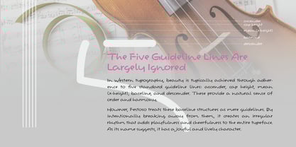
The Five Guideline Lines Are Largely Ignored
In Western typography, beauty is typically achieved through adherence to five standard guideline lines: ascender, cap height, mean (x-height), baseline, and descender. These provide a natural sense of order and harmony.
However, Festoso treats these baseline structures as mere guidelines. By intentionally breaking away from them, it creates an irregular rhythm that adds playfulness and cheerfulness to the entire typeface. As its name suggests, it has a joyful and lively character.
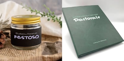
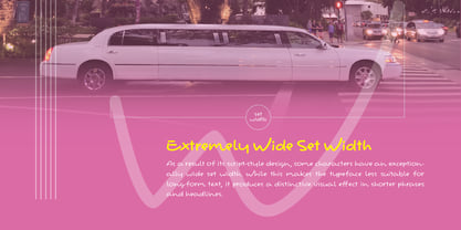
Extremely Wide Set Width
As a result of its script-style design, some characters have an exceptionally wide set width. While this makes the typeface less suitable for long-form text, it produces a distinctive visual effect in shorter phrases and headlines.
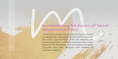
Incorporating the charm of 'hané' (brushstroke flicks)
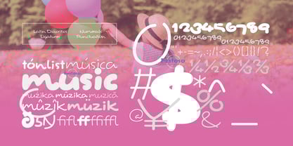
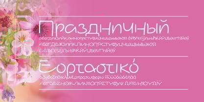
The finishing strokes of [a], [h], [j], [k], [l], [m], and [n] are deliberately designed to incorporate the characteristic "hané" (upward flick). These are relatively frequently used letters, and they naturally add a lively rhythm to the text. Meanwhile, the Cyrillic and Greek characters have been designed more modestly to maintain legibility.
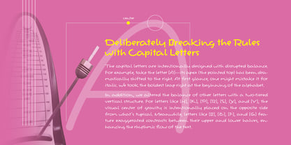
Deliberately Breaking the Rules with Capital Letters
The capital letters are intentionally designed with disrupted balance. For example, take the letter [A]—its apex (the pointed top) has been dramatically shifted to the right. At first glance, one might mistake it for italic. We took the boldest leap right at the beginning of the alphabet.
In addition, we altered the balance of other letters with a two-tiered vertical structure. For letters like [H], [K], [P], [R], [S], [X], and [Y], the visual center of gravity is intentionally placed on the opposite side from what’s typical. Meanwhile, letters like [B], [E], [F], and [G] feature exaggerated contrasts between their upper and lower halves, enhancing the rhythmic flow of the text.
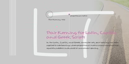
Pair Kerning for Latin, Cyrillic, and Greek Scripts
In the Latin, Cyrillic, and Greek character sets, pair kerning has been applied to side bearings where proportional metrics alone could not adequately address awkward or unnatural spacing.