Skip to content
Skip to main content

Finer

by Maikohatta
Individual Styles from $15.00 USD
The Finer Font Family was designed by Gilang Ternadho and published by Maikohatta. Finer contains 1 styles. More about this family

About the family


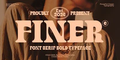
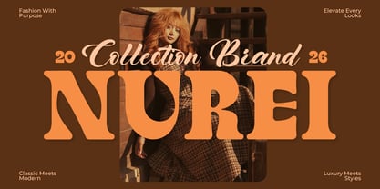
Introducing our new product Finer – Classic Bold Serif Typeface

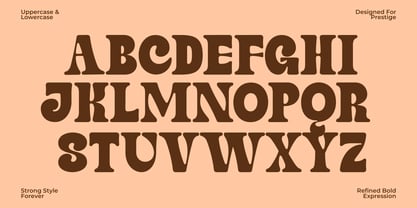
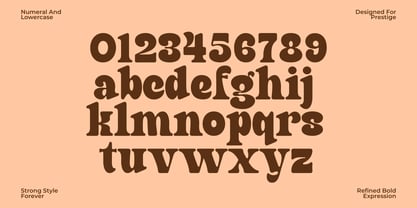
Finer is a bold classic serif typeface that blends timeless elegance with strong vintage character. Featuring thick letterforms, smooth curves, and refined serifs, this font delivers a powerful visual presence while maintaining exceptional readability. Inspired by classic editorial typography and heritage branding, Finer is designed to make every headline stand out.

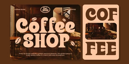
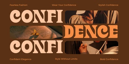
Whether you're creating luxury branding, premium logos, vintage packaging, magazine covers, apparel graphics, whiskey labels, restaurant branding, or eye-catching posters, Finer brings sophistication and confidence to every design. Its bold personality makes it perfect for projects that demand a distinctive and memorable look.

Designers: Gilang Ternadho

Foundry: Maikohatta

MyFonts debut: Jul 27, 2026

Finer

About Maikohatta

Embark on a typography exploration guided by Maikohatta, a seasoned authority in the intricate realm of visual communication. With a steadfast commitment to precision and meticulousness, Maikohatta's expertise shines through.In Maikohatta's interpretation, typography transcends the mere arrangement of letters; it metamorphoses into a harmonious fusion of visual artistry and practicality. Each typeface, whether thoughtfully selected or uniquely crafted, contributes as a distinctive stroke in the broader narrative canvas. Typography, in my view, extends beyond mere legibility, it is a means of evoking emotional connections that linger in the observer's memory.My forte lies in versatility. Whether blending refined serifs for enduring elegance, exploring avant-garde sans-serifs for contemporary appeal, or fashioning bespoke scripts for a personal touch, I navigate the expansive typographic domain with finesse.Beyond fonts and letterforms, I excel in constructing typographic systems that establish hierarchy, rhythm, and visual coherence. The outcome is a seamless fusion of aesthetics and utility, where each typographic decision serves a deliberate role in the grand orchestration of design.

Read more

Read less