Skip to content
Skip to main content

Gleaming the Cube

by Typodermic
Individual Styles from $69.95 USD
The Gleaming the Cube Font Family was designed by Ray Larabie and published by Typodermic. Gleaming the Cube contains 1 styles. More about this family

About the family


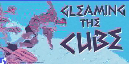
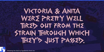
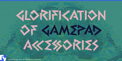
Late-’80s and early-’90s action graphics are easy to reduce to pixels, chrome and neon. Another visual language from the period was built from hard angles, wedges, zigzags and sudden changes of direction. Gleaming the Cube takes that route.

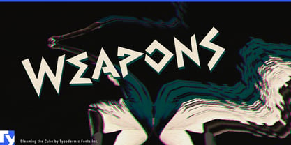
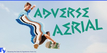
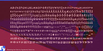
Its geometric, pseudo-Greek letterforms seem to collide with invisible boundaries and shoot off at new angles, giving short words a strong sense of ricochet. Capital letters at the beginning and end of a word can create a compact, emblem-like silhouette, while combination ligatures and custom circa-1990 symbols add more material for building display graphics.

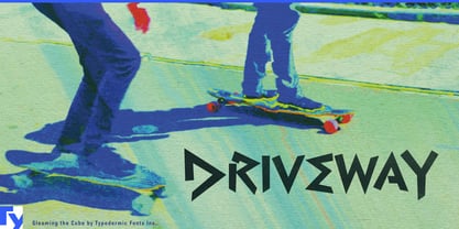
Skate culture is the historical anchor, making Gleaming the Cube a natural fit for deck graphics, skate-shop stickers, equipment packaging, BMX race plates and other places where lettering becomes part of the object. That same rebound geometry opens a surprisingly contemporary direction in pickleball: paddle faces, model names, ball packaging, tournament graphics and club merchandise can turn the font’s abrupt directional changes into a visual echo of the game itself.

The angles also work remarkably well with snacks. Sour candy, spicy chips, gum, freezer pops and slush drinks give wedges, bursts and zigzags somewhere useful to go, while the circa-1990 flavour can tap into the convenience-store nostalgia of older millennials and younger Gen X. For short product names, flavour names, rider names and headlines, Gleaming the Cube supplies the graphic impact; pair it with a quieter sans for ingredients, specifications, schedules and supporting copy.

Designers: Ray Larabie

Foundry: Typodermic

MyFonts debut: Aug 11, 2010

Gleaming the Cube

About Typodermic

Welcome to Typodermic Fonts, a spirited type foundry rooted in Nagoya, Japan, started by the Canadian typeface designer, Raymond Larabie in 2001. Our library brims with 500+ diverse typefaces to fuel creativity in graphic design, advertising, web, and app development. As digital type pioneers, we adopted web fonts and app licensing early, consistently pushing the design envelope. With Canadian heart and Japanese precision, we're your global partners in extraordinary typography. Explore Typodermic Fonts—where creativity meets character.

Read more

Read less
