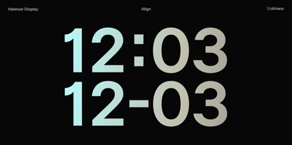
Halenoir Display Thin
Halenoir Display Thin Oblique
Halenoir Display Ultra Light
Halenoir Display Ultra Light Oblique
Halenoir Display Extra Light
Halenoir Display Extra Light Oblique
Halenoir Display Light
Halenoir Display Light Oblique
Halenoir Display Regular
Halenoir Display Regular Demo
Halenoir Display Regular Oblique
Halenoir Display Medium
Halenoir Display Medium Oblique
Halenoir Display Demi Bold
Halenoir Display Demi Bold Oblique
Halenoir Display Bold
Halenoir Display Bold Oblique
Halenoir Display Extra Bold
Halenoir Display Extra Bold Oblique
Halenoir Display Black
Halenoir Display Black Oblique
Halenoir Black Outline
Halenoir Black Outline Oblique
Halenoir Text Thin
Halenoir Text Thin Oblique
Halenoir Text Ultra Light
Halenoir Text Ultra Light Oblique
Halenoir Text Extra Light
Halenoir Text Extra Light Oblique
Halenoir Text Light
Halenoir Text Light Oblique
Halenoir Text Regular
Halenoir Text Regular Oblique
Halenoir Text Medium
Halenoir Text Medium Oblique
Halenoir Text Demi Bold
Halenoir Text Demi Bold Oblique
Halenoir Text Bold
Halenoir Text Bold Oblique
Halenoir Text Extra Bold
Halenoir Text Extra Bold Oblique
Halenoir Text Black
Halenoir Text Black Oblique
Halenoir Compact Display Thin
Halenoir Compact Display Thin Oblique
Halenoir Compact Display Ultra Light
Halenoir Compact Display Ultra Light Oblique
Halenoir Compact Display Extra Light
Halenoir Compact Display Extra Light Oblique
Halenoir Compact Display Light
Halenoir Compact Display Light Oblique
Halenoir Compact Display Regular
Halenoir Compact Display Regular Demo
Halenoir Compact Display Regular Oblique
Halenoir Compact Display Medium
Halenoir Compact Display Medium Oblique
Halenoir Compact Display Demi Bold
Halenoir Compact Display Demi Bold Oblique
Halenoir Compact Display Bold
Halenoir Compact Display Bold Oblique
Halenoir Compact Display Extra Bold
Halenoir Compact Display Extra Bold Oblique
Halenoir Compact Display Black
Halenoir Compact Display Black Oblique
Halenoir Compact Black Outline
Halenoir Compact Black Outline Oblique
Halenoir Compact Text Thin
Halenoir Compact Text Thin Oblique
Halenoir Compact Text Ultra Light
Halenoir Compact Text Ultra Light Oblique
Halenoir Compact Text Extra Light
Halenoir Compact Text Extra Light Oblique
Halenoir Compact Text Light
Halenoir Compact Text Light Oblique
Halenoir Compact Text Regular
Halenoir Compact Text Regular Oblique
Halenoir Compact Text Medium
Halenoir Compact Text Medium Oblique
Halenoir Compact Text Demi Bold
Halenoir Compact Text Demi Bold Oblique
Halenoir Compact Text Bold
Halenoir Compact Text Bold Oblique
Halenoir Compact Text Extra Bold Oblique
Halenoir Compact Text Extra Bold
Halenoir Compact Text Black
Halenoir Compact Text Black Oblique
Halenoir Expanded Thin
Halenoir Expanded Thin Oblique
Halenoir Expanded Ultra Light
Halenoir Expanded Ultra Light Oblique
Halenoir Expanded Extra Light
Halenoir Expanded Extra Light Oblique
Halenoir Expanded Light
Halenoir Expanded Light Oblique
Halenoir Expanded Regular
Halenoir Expanded Regular Demo
Halenoir Expanded Regular Oblique
Halenoir Expanded Medium
Halenoir Expanded Medium Oblique
Halenoir Expanded Demi Bold
Halenoir Expanded Demi Bold Oblique
Halenoir Expanded Bold
Halenoir Expanded Bold Oblique
Halenoir Expanded Extra Bold
Halenoir Expanded Extra Bold Oblique
Halenoir Expanded Black
Halenoir Expanded Black Oblique
Halenoir Expanded Black Outline
Halenoir Expanded Black Outline Oblique
Halenoir Patterned