Hello, and welcome to the REN FONT foundry!
REN FONT has steadily built its reputation by repeatedly earning accolades in the Typeface category of the “Yearbook,” an exhibition organized by the Japan Typography Association (NPO). Founded in 2001 with the aim of bringing a fresh breeze to the font industry, REN FONT continues to create distinctive typefaces that stand out.
The hand-drawn-style fonts crafted by REN FONT’s type designer, Kazuo Kanai, have received high praise from professional designers and typographers for their exceptional quality.
A Message from Kazuo Kanai
With the exception of our comprehensive typeface Waon, our company has been particularly dedicated to producing kana fonts in the traditional Mincho and Gothic styles. Most of these fonts have been developed as multi-weight families — and there’s a good reason for that.
In Japanese text, kana characters account for roughly 70% of the total. Even so, kana fonts have little significance on their own; it is only when combined with kanji that they take on “meaning” and come to life.
Most vendors offer font weights in seven to nine variations, from “Light” to “Ultra,” but there are no universal standards for these weight categories — each vendor defines them differently. As a result, a “Light” weight from one vendor may differ subtly in thickness from another. For kana fonts to pair harmoniously with such variations and truly come alive, a finer gradation of weights is essential.
This is why our kana fonts feature such detailed weight variations.
Simply changing the kana can greatly enrich the expression of a typeface.
We hope you will make the most of our kana fonts, blending them freely with other typefaces to create combinations that perfectly suit your taste.
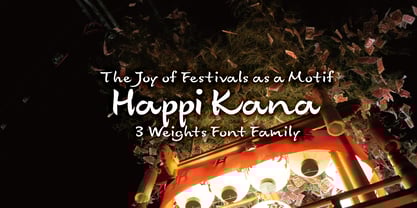
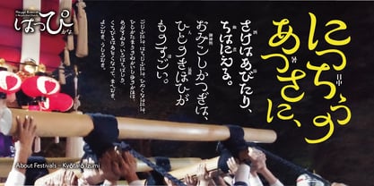
The Joy of Festivals as a Motif
Happi Kana 3-Weight Font Family
A lively and cheerful typeface, carrying traces of Mincho and faint echoes of Clerical Script.
The design expresses the swaying of a “happi” coat in all directions—and yes, it also plays on the word “happy.” Not a single character here is “normal.” The image is straight out of the wild energy of the Kishiwada Danjiri Festival! Bursting with unruly movement, this typeface is perfect for designs that call for action and dynamism. How you use it—and which kanji you pair it with—is entirely up to you. We look forward to seeing your creativity.
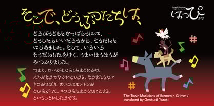
Display kana fonts are generally extremely stylized, which often makes them difficult to balance in ordinary text settings. Happi Kana takes this to the extreme. That’s why every glyph in Happi Kana has been carefully pair-kerned, both in vertical and horizontal composition. Simply applying metric processing will yield a well-balanced layout.
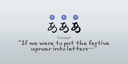
If a Festival Were Turned into Letters…
This typeface is based on the everyday handwriting of our type designer, Kazuo Kanai. It fuses Mincho with subtle remnants of Clerical Script, then amplifies them into a wildly exaggerated, energetic form. The family consists of three weights, from M (Medium) to H (Heavy).
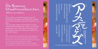
Its personality is far too strong for continuous text, but try it in short headlines or accent pieces—it will bring vibrancy and impact to the page. Both vertical and horizontal typesetting are supported with proportional adjustments and pair kerning.