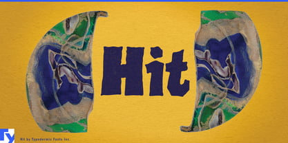
A perfectly polished display face can feel out of place when the making is part of the attraction. Dough gets shaped in front of the customer, dumplings are folded behind the counter, a food hall changes personality throughout the day, or an animated world is visibly built from paper, clay, and physical objects. Hit brings a similarly constructed quality to typography: irregular, chunky forms that look made rather than engineered into flawless uniformity.
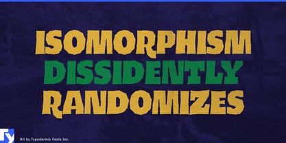
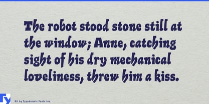
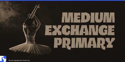
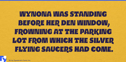
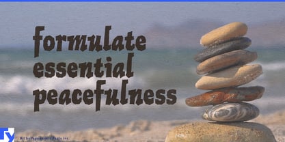
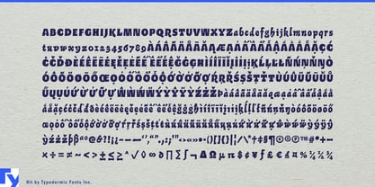
Its uneven silhouettes come from the letterforms themselves rather than scratches or artificial wear. In all caps, Hit becomes a dense, slightly crooked block of lettering with enough mass for signs, titles, and large category names. Mixed case reveals a more animated side, with narrow, slanted lowercase forms creating an eccentric rhythm. That gives the single style two useful registers.
Contemporary food halls and mixed-use dining spaces are a natural setting. These venues generate vendor names, counter headings, temporary concepts, pop-up graphics, event titles, wall messages, merchandise, and seasonal campaigns. Hit can create large architectural words such as BAKERY, NOODLES, PICKLES, or DINNER while mixed-case settings loosen the tone for dishes, promotions, and smaller attractions within the space.
Fermentation-led bakeries and hybrid food businesses make especially good use of its physical character. Sourdough bakeries, koji bakeries, pickle and preserve counters, fermentation cafés, and businesses that shift from bread and sandwiches during the day to dinner or events at night can use Hit for daily specials, sandwich boards, paper bags, menu headings, window graphics, takeaway stickers, and evening-event titles without resorting to fake letterpress nostalgia.
Process-forward casual food extends the same idea into sourdough pizza, focaccia sandwiches, hand-pulled noodles, dumpling counters, rotisserie concepts, and other establishments where preparation is visible. Short category words and dish names become substantial graphic elements across menu boards, greaseproof paper, takeaway cartons, staff shirts, delivery packaging, and storefront campaigns.
The same quality works in tactile entertainment. Stop-motion productions, clay animation, cut-paper campaigns, collage-heavy title sequences, practical-set advertising, and handmade game worlds can use Hit for main titles, chapter cards, character names, location headings, packaging, and promotional graphics that belong naturally inside a visibly constructed world.
Hit is most useful where the work wants to show its hands. Food halls, bakeries, fermentation counters, process-forward restaurants, stop-motion, and handmade entertainment all benefit from display lettering that feels constructed and imperfect without looking artificially damaged or nostalgically distressed.