Hello, and welcome to the REN FONT foundry!
REN FONT has steadily built its reputation by repeatedly earning accolades in the Typeface category of the “Yearbook,” an exhibition organized by the Japan Typography Association (NPO). Founded in 2001 with the aim of bringing a fresh breeze to the font industry, REN FONT continues to create distinctive typefaces that stand out.
The hand-drawn-style fonts crafted by REN FONT’s type designer, Kazuo Kanai, have received high praise from professional designers and typographers for their exceptional quality.
A Message from Kazuo Kanai
With the exception of our comprehensive typeface Waon, our company has been particularly dedicated to producing kana fonts in the traditional Mincho and Gothic styles. Most of these fonts have been developed as multi-weight families — and there’s a good reason for that.
In Japanese text, kana characters account for roughly 70% of the total. Even so, kana fonts have little significance on their own; it is only when combined with kanji that they take on “meaning” and come to life.
Most vendors offer font weights in seven to nine variations, from “Light” to “Ultra,” but there are no universal standards for these weight categories — each vendor defines them differently. As a result, a “Light” weight from one vendor may differ subtly in thickness from another. For kana fonts to pair harmoniously with such variations and truly come alive, a finer gradation of weights is essential.
This is why our kana fonts feature such detailed weight variations.
Simply changing the kana can greatly enrich the expression of a typeface.
We hope you will make the most of our kana fonts, blending them freely with other typefaces to create combinations that perfectly suit your taste.
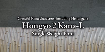
Elegant Kana Characters, Including Hentaigana
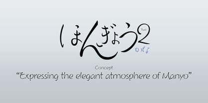
Hongyo 2 Kana-L
With elegant kana characters and a full set of hentaigana, 奔行2かな-L (Honko 2 Kana-L) originates from “Seiren Hongyo-L,” a typeface selected in the Typeface category of the “Japan Typography Annual 2004” competition organized by the Japan Typography Association in 2004.
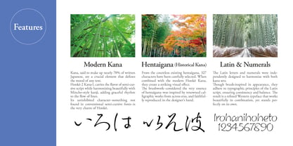
The font includes hiragana, katakana, Latin letters, symbols, and hentaigana. All characters are rendered with a brush style at an intermediate level between kaisho (standard script) and gyosho (semi-cursive), expressing the free-spirited dynamism of calligraphy. The hentaigana can be easily accessed as variant forms corresponding to modern kana characters.
In addition, the font supports Unicode (for some character sets). The hentaigana are designed to harmonize with modern kana, enabling a unique blend of old and new characters within the same composition.
About Hentaigana
Hongyo 2 Kana-L includes 327 hentaigana characters corresponding to all modern kana “sounds” except for contracted sounds, sokuon (small tsu), voiced sounds, and the kana “ん.” It also supports Unicode for hentaigana, as well as proportional and pair kerning for both horizontal and vertical writing.
Note: This font is not compatible with “Honko Kana Std-L.”