Select this license type when you are developing an app for iOS, Android, or Windows Phone, and you will be embedding the font file in your mobile application's code.
House Of Cards
by Dharma Type


- Aa Glyphs
-
Best ValueFamily Packages
- Individual Styles
- Tech Specs
- Licensing
Per style:
$12.49
Pack of 4 styles:
$49.99
About House Of Cards Font Family
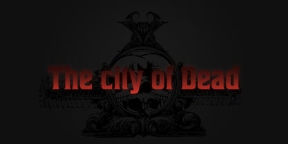
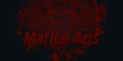
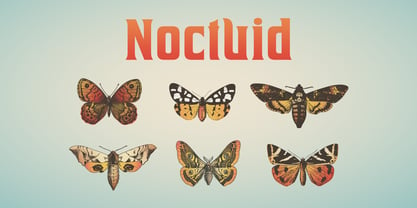
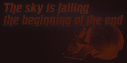
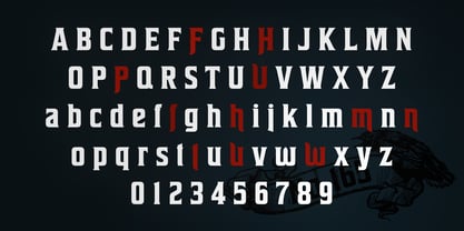
House of Cards is inspired by and based on retro Hamilton’s Teniers typeface which is popular wooden type fonts of the 19th century. To make natural and contemporary impressions, the original lowercase design was slightly changed from the original but all glyphs had been designed carefully to be retro-looking of the old time and to fill all with nostalgia. This modern wood type includes 2 weights and their matching italic style and all style have sprayed ends(beginning) alternates for F, H, P, U, f, h, m, n, t, u, and w which can be accessed by using OpenType Stylistic alternates or swash alts. House of Cards will be the best solution for posters, titles and anywhere you need vintage lettering.
Designers: Ryoichi Tsunekawa
Publisher: Dharma Type
Foundry: Dharma Type
Design Owner: Dharma Type
MyFonts debut: Oct 15, 2012

About Dharma Type
The design style is wide-ranging from retro and classic to experimental and futuristic, from formal to informal, because the direction of the project is to fill the small niche of design demand.So far, Dharma Type released about a hundred of Latin typefaces including Bebas Neue (free open sourced font), and many of their fonts have been featured in various publications and used in multiple media such as movie titles(e.g., La la land), brand logos, and posters.
Read more
Read less
- Choosing a selection results in a full page refresh.