Skip to content
Home / Fonts / Hoefler & Co. / Ideal Sans
Ideal Sans

Ideal Sans®

by Hoefler & Co.
Licenses from $239.99
Complete family of 16 fonts: $418.99
Ideal Sans Font Family was designed by Jonathan Hoefler and published by Hoefler & Co.. Ideal Sans contains 32 styles and family package options.

More about this family
FREE 30-DAY TRIAL of Monotype Fonts to get over 150,000 fonts from more than 1,400 type foundries. Start free trial
Start free trial
  • Ideal Sans Thin Ideal Sans Thin

  • Ideal Sans Thin Italic Ideal Sans Thin Italic

  • Ideal Sans Extra Light Ideal Sans Extra Light

  • Ideal Sans Extra Light Italic Ideal Sans Extra Light Italic

  • Ideal Sans Light Ideal Sans Light

  • Ideal Sans Light Italic Ideal Sans Light Italic

  • Ideal Sans Book Ideal Sans Book

  • Ideal Sans Book Italic Ideal Sans Book Italic

  • Ideal Sans Medium Ideal Sans Medium

  • Ideal Sans Medium Italic Ideal Sans Medium Italic

  • Ideal Sans Semibold Ideal Sans Semibold

  • Ideal Sans Semibold Italic Ideal Sans Semibold Italic

  • Ideal Sans Bold Ideal Sans Bold

  • Ideal Sans Bold Italic Ideal Sans Bold Italic

  • Ideal Sans Black Ideal Sans Black

  • Ideal Sans Black Italic Ideal Sans Black Italic

Per style:

$26.18

Pack of 16 styles:

$418.99

See 6 more... See less...
  • Ideal Sans Light Ideal Sans Light

  • Ideal Sans Light Italic Ideal Sans Light Italic

  • Ideal Sans Book Ideal Sans Book

  • Ideal Sans Book Italic Ideal Sans Book Italic

  • Ideal Sans Medium Ideal Sans Medium

  • Ideal Sans Medium Italic Ideal Sans Medium Italic

  • Ideal Sans Semibold Ideal Sans Semibold

  • Ideal Sans Semibold Italic Ideal Sans Semibold Italic

  • Ideal Sans Bold Ideal Sans Bold

  • Ideal Sans Bold Italic Ideal Sans Bold Italic

Per style:

$31.39

Pack of 10 styles:

$313.99

  • Ideal Sans Thin Ideal Sans Thin

  • Ideal Sans Thin Italic Ideal Sans Thin Italic

  • Ideal Sans Extra Light Ideal Sans Extra Light

  • Ideal Sans Extra Light Italic Ideal Sans Extra Light Italic

  • Ideal Sans Black Ideal Sans Black

  • Ideal Sans Black Italic Ideal Sans Black Italic

Per style:

$39.99

Pack of 6 styles:

$239.99

About Ideal Sans Font Family


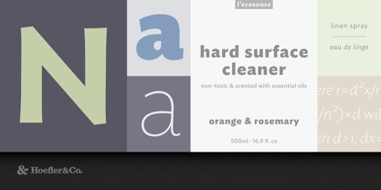
Setting aside the easy pursuit of digital perfection, Ideal Sans favors handmade forms that help it achieve different goals: warmth, craftsmanship, and humanity.

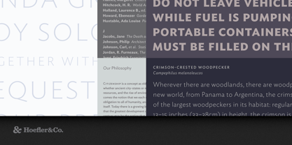
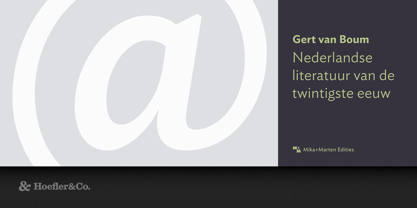
The Ideal Sans typeface was designed by Jonathan Hoefler beginning in 1991. A sans serif in the ‘humanist’ style, its capital letters reference the proportions of classical inscriptions, and its lowercase reveals vestiges of the calligraphic pen. Unlike most sans serifs, it avoids symmetry, repeated shapes, and even straight lines, instead using subtly bowed curves and delicate shifts in stress to achieve a warm and handmade feeling. First appearing in the pages of Entertainment Weekly in 1999, Ideal Sans was expanded into a larger family of typefaces for the Art Institute of Chicago in 2006, and was published by Hoefler&Co in 2011.

From the desk of the designer:

The first sans serif typefaces, designed in the early nineteenth century, bore the names of ancient cultures — “Egyptian,” “Ionic,” “Doric”, “Gothic” — even though these typefaces shared none of the qualities of genuine lettering from the ancient world. 2,500 years earlier, Greek inscriptions were taut and lively; by comparison, these nineteenth century printing types were impassive and deliberate. It would be nearly a century before typefounders would take an interest in inscriptional lettering, and begin to imbue their sans serifs with classical proportions, fluid kinesthetic movements, and references to calligraphic form. This new approach was nurtured by the calligrapher Edward Johnston, designer of the London Underground’s signature alphabet in 1916, and by Eric Gill, whose eponymous sans serif was produced by the Monotype Corporation a decade later. Because these designs were rooted in classical form, and their designers dedicated to traditional crafts, the new style became known as the Humanist sans serif. Nonetheless, these designs were often products more of the machine than the hand, chilly and austere designs shaped by unbending rules, whose occasional moments of whimsy were so out of place as to feel volatile and disquieting.

Ideal Sans began as an attempt to reclaim the Humanist style, and to restore its missing humanity. Like all Humanist designs, Ideal Sans has classical rather than industrial proportions (its capitals vary greatly in width, from the almost circular O to the half-square E), and it favors traditional forms like the two-storey lowercase a and g. Unlike most sans serifs, it is allergic to geometry: the design contains almost no straight lines, very few symmetries, and it takes every opportunity to resist formulaic rules. These policies make Ideal Sans engaging at large sizes, and help it to perform at small ones, giving the design a warm, organic, and handmade feeling.

Designers: Jonathan Hoefler

Publisher: Hoefler & Co.

Foundry: Hoefler & Co.

Design Owner: Hoefler & Co.

MyFonts debut: null

Ideal Sans® is a registered trademark of The Hoefler Type Foundry, Inc.

About Hoefler & Co.

Famous for designing long-lived typefaces marked by high performance and high style, Hoefler&Co creates the fonts that give voice to the world’s foremost institutions, publications, causes, and brands. With a library of 1,500 fonts designed for print, web, office, and mobile fonts, Hoefler&Co is everywhere. Their typefaces shaped the presidential campaigns of Barack Obama and Joe Biden; they’re on the cornerstone of One World Trade Center and on every iPhone ever made. They serve brands from Delta Air Lines to Tiffany & Co., publications from Harper’s Bazaar to The New York Times, institutions such as the Guggenheim Museum, The Public Theater, and New York University, and non-profit organizations including the Natural Resources Defense Council, the Southern Poverty Law Center, and The Peconic Land Trust. The Premium foundry page can be viewed Here.

Read more

Read less