
Skip to content
Skip to main content

Jack Stanislav

by deFharo
Individual Styles from $22.00 USD
The Jack Stanislav Font Family was designed by Fernando Haro and published by deFharo. Jack Stanislav contains 1 styles. More about this family

About the family


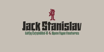
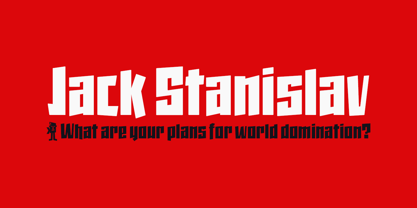
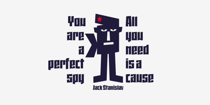
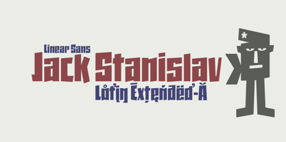
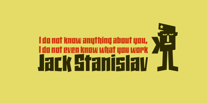
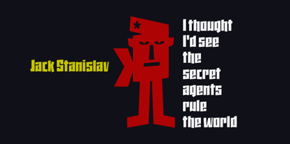
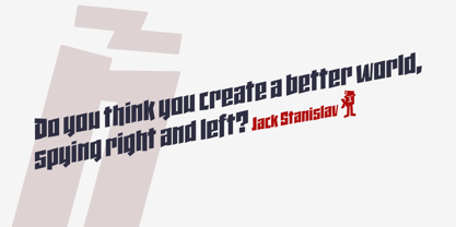
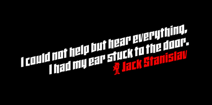
Very condensed typography, thick line and fun look for headlines and advertising where you are looking for saving space and originality at the same time. The upper inclination of the letters, the combination of horizontal with inclined forms, the ascending and descending short, and the lower elongation of some antlers will allow you to print varied styles with a lot of movement according to the context of the design. I started drawing this font with the intention of creating a new decorative typeface Blackletter style but modernizing the strokes, after drawing several letters imitating the ductus of this type of fonts trying to simplify them, emerged all the DNA of the current Jack Stanislav, finally a retro typography without Serif of linear strokes that mimic the angle of a thick pen. Use the following keys to write the bitcoin symbol and the Jack icon: b #, a #

Designers: Fernando Haro

Foundry: deFharo

MyFonts debut: Jan 12, 2018

Jack Stanislav

About deFharo

deFharo is the independent type foundry of Spanish graphic and type designer Fernando Haro. With more than 30 years of experience in graphic and advertising design and over a decade devoted to typeface design, Fernando Haro has developed an eclectic body of work that ranges from editorial and corporate typefaces to expressive display, geometric, technological, retro and experimental designs. His approach combines visual character with typographic functionality. Every typeface begins with drawing, proportion and a clear visual idea, and evolves through meticulous work on spacing, metrics, kerning, optical corrections and OpenType features. Rather than following a single recognizable style, deFharo explores different typographic territories according to the personality and purpose of each project. Some families are designed for long-form reading and editorial systems; others are built for branding, headlines, packaging, signage or highly expressive graphic compositions. A strong interest in vector drawing, typographic systems and functional design runs throughout the collection. Alternative characters, small caps, Petite Caps, fractions, numerals, ligatures, symbols and extended language support are frequently developed as integral parts of the typeface rather than as afterthoughts. The result is a growing collection of typefaces designed to be both distinctive and useful — fonts with personality, but also with the technical precision required for professional graphic and editorial work. deFharo typefaces are designed by Fernando Haro and published independently from Spain.

Read more

Read less