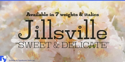
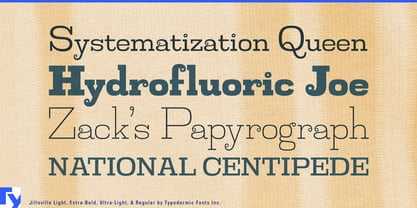
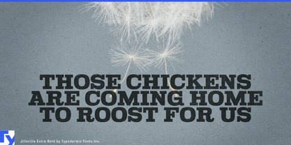
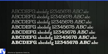
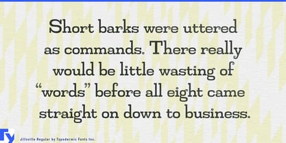
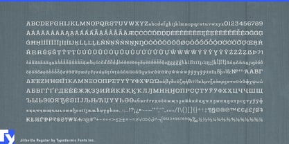
Cute typography often comes with a tradeoff. Push too far toward sweetness and the result can feel childish; reach for a slab serif and the mood often swings toward workwear, newspapers or something deliberately sturdy. Jillsville sits in a rarer middle ground. Its low x-height, small loops and rounded details soften the slab construction without taking away its structure, giving it a friendly decorative quality that still has enough weight to hold a product name together.
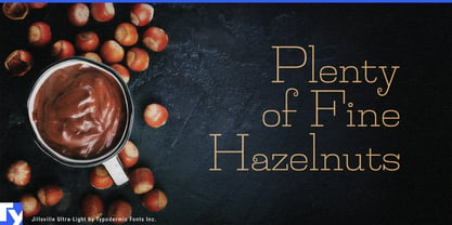
Chocolate is especially natural territory. Chocolate bars, truffle boxes, praline assortments, bonbon collections, hot-chocolate mixes and hazelnut spreads need lettering that can suggest pleasure and charm without looking either rustic or austerely luxurious. Jillsville can make a chocolate name feel inviting while its slabs keep the packaging from drifting into delicate script territory.
Gift confectionery broadens that idea. Filled biscuits, petits fours, macarons, fruit jellies, seasonal sweets and boxed assortments are often bought as presents rather than everyday snacks, so the typography has to feel charming and presentable at the same time. Jillsville suits gift boxes, seasonal displays and shop signs that need warmth without looking juvenile.
Patisseries, dessert cafés and tea rooms give the family room to work beyond packaging. Shop names, pastry boxes, afternoon-tea cards, dessert-menu headings and individual cake names can use Jillsville at the larger sizes where its unusual lowercase details are easy to appreciate. A more conventional companion face can handle ingredients, prices and longer descriptions.
Baking products and sweet pantry goods offer another useful home. Cookie boxes, cake mixes, specialty jams, syrups, spreads and baking kits can use the same combination of friendliness and structure. Jillsville works particularly well when the product should feel pleasurable and slightly decorative without falling into either farmhouse nostalgia or children’s branding.
Its personality also travels naturally into needlecraft and small creative shops. Yarn labels, knitting stores, embroidery kits, sewing-pattern covers and fabric boutiques benefit from typography that feels handmade-adjacent without actually looking handwritten. Stationery, journals, wrapping paper and seasonal giftware can draw on the same quality.
The low x-height makes Jillsville better suited to display typography than small print, so it is most effective in names, headings, labels and short prominent lines where its loops and proportions have room to show. It is a slab serif for subjects that need sweetness without infantilization and sturdiness without toughness; especially at home on a chocolate box, pastry-shop window, yarn label, gift set or dessert menu.