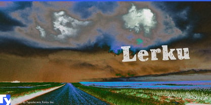
Distressing one title is easy. Distressing every quest, card, item, settlement and player-created campaign is a production problem. The text may change after release, arrive through localization or be generated by a system the designer never sees. Pre-rendering every possibility creates piles of image assets; switching to clean interface type breaks the visual world. Lerku puts coarse printed wear directly into live text.
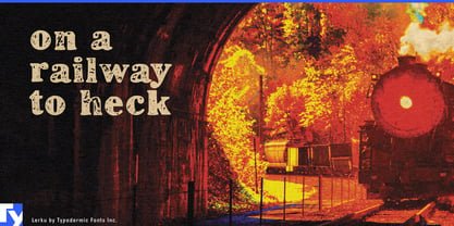
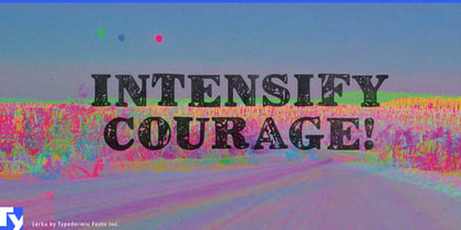
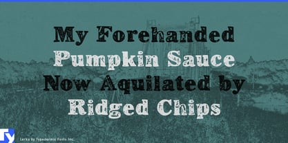
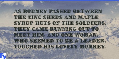
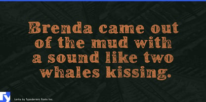
Its chunky serif forms have irregular traced edges that settle into the impression of imperfect ink at small and medium display sizes. The relatively economical outlines also make Lerku more practical as a textured webfont than an intricately detailed distressed face. It is suited to changing labels and interface headings rather than enormous titles whose contours will be examined individually.
Digital card games and tabletop-inspired interfaces give that texture a practical role. Card titles, deck categories, character names, scenario headings and expansion labels may number in the hundreds, with new content added long after launch. Lerku keeps those names inside a world of worn cards, printed manuals and handled game pieces without converting each phrase into separate artwork. A cleaner companion face can carry rules, statistics, prices and accessibility-critical information.
Narrative, crafting and management games create similar demands. Recipe names, inventory categories, workshop headings, railway stations, cargo types, journal sections, map regions and evidence labels all need atmosphere while remaining editable. Lerku can make them feel printed, stamped, salvaged or passed from hand to hand while quantities, controls and tooltips remain clear in conventional interface type.
Procedural and player-generated content pushes the problem further. A game may create settlements, missions, artifacts, factions or seasonal events that were never available for manual lettering. Virtual tabletop platforms and campaign tools must accommodate names invented by every game master and player. Lerku allows unpredictable text to inherit the same weathered treatment as the rest of the product.
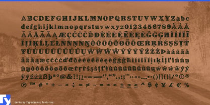
Built-in ligatures help recurring letter combinations avoid the mechanical sameness common to distressed fonts. Browser-based campaign managers, digital rulebooks and companion sites can use Lerku for scenario names, journal tabs, character classes and chapter markers while keeping the text selectable, searchable and localizable.
Lerku is strongest where its wear is perceived as texture rather than illustration: card titles, quest names, inventory headings, location labels and short interface prompts. It gives large systems of changing game text the handled character of imperfect printing without requiring every phrase to be distressed by hand.