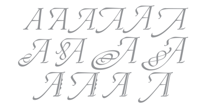
This is a listing of all glyphs contained in the font, including OpenType variants that may only be accessible via OpenType-aware applications.
Each basic character (“A”) is followed by Unicode variants of the same character (Á, Ä…), then OpenType variants (small caps, alternates, ligatures…). This way you can see all the variations on a single character in one place.
MyFonts licenses are tailored for individual creatives. Not all licenses are compatible with broad usage cases or complicated creative workflows, so make sure to read the full EULA text for details. If you are licensing fonts for use at an Agency or Company, or if you have a usage requirement that isn't listed below or are unsure about the use cases shown here, contact us and we'll help you determine the best fit for your needs.
The following licenses are available for this font.
Desktop: for creating designs
This entry-level license enables personal and commercial traditional graphic designer work.
The Desktop License allows you to create, print, and share flat, non-editable designs such as:
Brand identity
Use fonts to create a strong and consistent brand identity.
Videos
Apply fonts in titles, credits, and on-screen text.
PDFs
Style reports, brochures, and digital documents.
Greeting cards
Design unique, personalized cards for any occasion.
Logos
Craft memorable, professional logo typography.
Signage (wayfinding & billboards)
Make clear, eye-catching signage for indoor or outdoor use.
Flyers
Set readable, attractive headlines and layouts.
Packaging
Enhance product packaging with stylish text.
Album covers
Print custom text designs on t-shirts, hoodies, and more.
Posters
Bold, eye-catching poster layouts.
Invitations
Create stylish, personalized invitations for events.
Social posts
Enhance graphics and captions with unique fonts.
Business cards
Craft professional, memorable business card designs.
Fonts cannot be hosted on DAMs as downloadable assets.
Show all
Desktop licenses are based on the number of users of the fonts. You can change the number of users by clicking the quantity dropdown option on Buying Choices or Cart pages.
Please be sure to review the listing foundry's
Desktop license agreement
as some restrictions may apply—such as use in logos/trademarks, geographic restrictions (number of locations), and products that will be sold.
Adding users later:
Desktop licenses are cumulative. If you require a Desktop license that covers additional users, simply place a new order for the same Desktop package, for the number of additional users.
Webfonts allow you to embed the font into a webpage using the @font-face rule, so paragraphs and headings
of text can be styled as the webfont. You will be serving the webfont kit for your own site and linking
it in the CSS.
Webfonts can be used on a single domain. Agencies responsible for multiple websites, for example web
design agencies or hosting providers, may not share a single webfont license across multiple websites.
If the font file itself won't be embedded in the website (for example, when the font is used in a static
graphic image such as a logo) you should purchase a Desktop license instead.
Most foundries on MyFonts offer their webfonts with the Annual license model. Click here to
Learn more.
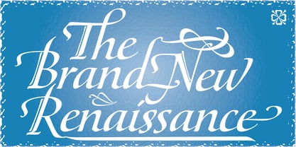
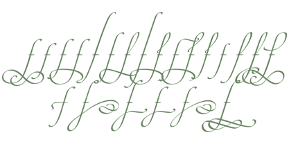
Out of a lifelong inner struggle, Philip Bouwsma unleashes a masterpiece that reconciles classic calligraphy with type in a way never before attempted.
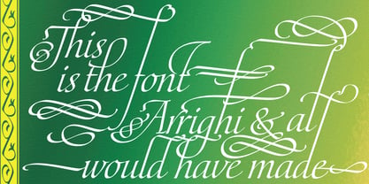
Maestro takes its cue from the Italian chancery cursive of the early sixteenth century. By this time type ruled the publishing world, but official court documents were still presented in calligraphy, in a new formal style of the high Renaissance that was integrated with Roman letters and matched the refined order of type. The copybooks of Arrighi and others, printed from engraved wood blocks, spread the Italian cancellaresca across Europe, but the medium was too clumsy and the size too small to show what was really happening in the stroke. Arrighi and others also made metal fonts that pushed type in the direction of calligraphy, but again the medium did not support the superb artistry of these masters or sustain the vitality in their work. As the elegant sensitive moving stroke of the broad pen was reduced to a static outline, the human quality, the variety and the excitement of a living act were lost. Because the high level of skill could not be reproduced, the broad pen was largely replaced by the pointed tool. The modern italic handwriting revival is based on a simplified model and does not approach the level of this formal calligraphy with its relationship to the Roman forms.
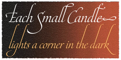
Maestro is the font that Arrighi and his colleagues would have made if they had had digital technology. Like the calligraphic system of the papal chancery on which it is modelled, it was not drawn as a single finished alphabet, but evolved from a confluence of script and Roman; the script is formalized by the Roman to stand proudly in a world of type. Maestro came together on screen over the course of several years, through many versions ranging widely in style, formality, width, slant, weight and other parameters. On one end of the spectrum, looking back to tradition it embodies the formal harmony of the Roman capitals and the minuscule which became the lower case. On the other it is a flowing script letter drawing on the spirit of later pointed pen and engravers scripts. As its original designers intended, it works with simple Roman capitals and serifs or swash capitals and baroque flourishes. The broad pen supplies weight and substance to the stroke which carries energy through tension in balanced s-curves. Above all it is meant to convey the life and motion of formal calligraphy as a worthy counterbalance to the stolid gravity of metal type.
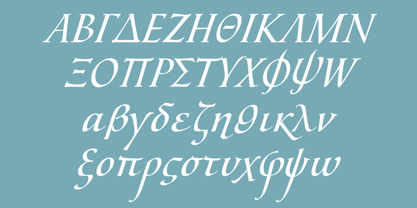
The Maestro family consists of forty fonts distributed over two weights. The OpenType version compresses the family considerably down to two fonts, regular and bold, each containing the entire character set of twenty fonts, for a total of more than 3350 characters per font. These include a wide variety of stylistic alternates, ligatures, beginning and ending letters, flourishes, borders, rules, and other extras. The Pro version also includes extended linguistic support for Latin-based scripts (Western, Central and Eastern European, Baltic, Turkish, Welsh/Celtic, Maltese) as well as Greek.
For more thoughts on Maestro, its background and character sets, please read the PDF accompanying the family.
Canada Type is an independent digital lettering and font development studio based in Toronto. We were founded in 2004 by a couple of experienced designers who were not pleased with the quality and licensing terms of fonts around the turn of the century. Since then we have greatly expanded, built a versatile and popular retail catalogue, and helped many designers bring international attention to their talents in the constantly changing and increasingly competitive world of type design.While Canada Type offers a varied library of fonts, our bread and butter are really the bespoke services we’ve been providing to companies across many fields on local, national and global levels. Over the past 20 years, we have developed custom fonts for companies in a variety of sectors, ranging from the marketing, financial and service industries to major film studios, big software corporations, and telecom/broadcast outfits.This is what we love to do, and we’re fortunate to do it on a daily basis. If you consider well-crafted typography essential to your brand’s visual communication, we’re here to help, so please reach out. The promise you get from us is one of care, quality and highly informed, satisfying results.https://canadatype.com