Skip to content
Skip to main content

Markerfield

by Typodermic
Individual Styles from $69.95 USD
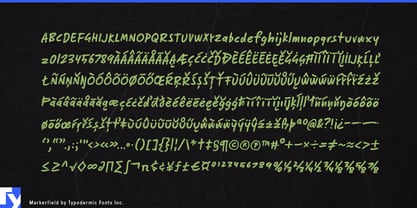
The Markerfield Font Family was designed by Ray Larabie and published by Typodermic. Markerfield contains 1 styles. More about this family

About the family


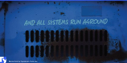
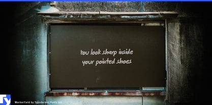
Polished layouts sometimes need a note from a person. A formal caption can feel too integrated into the design; a script font often looks deliberately decorative; drawing every comment by hand becomes tedious once annotations need to be revised, repeated, or translated. Markerfield supplies that human markup layer in editable type.

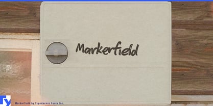
At small sizes, its dry-marker texture takes on the look of thin felt-tip pen. Set slightly off-axis, it becomes especially convincing as a note added after the main layout was finished. Short comments such as “Start here,” “Move this,” “Check clearance,” or “Option B” can sit beside arrows, circles, underlines, screenshots, and renderings without becoming another formal level in the typographic hierarchy.

That makes Markerfield particularly useful for design review. Architecture presentations, product-design boards, engineering proposals, packaging concepts, campaign comps, UX reviews, and internal creative presentations can use it for revisions, alternatives, material changes, unresolved details, and review notes while the underlying project keeps its normal typography.

Presentation annotation offers a similar role. Management consultancies, strategy teams, engineering firms, research groups, and corporate planning departments can add margin notes, chart observations, circled figures, caveats, and key takeaways without forcing every intervention into another box or callout style.

Software and digital-product communication provide another strong setting. SaaS launches, onboarding material, product tours, customer academies, cybersecurity explainers, release announcements, and AI-product demonstrations often show interface screenshots covered with arrows and short notes. Markerfield can supply comments such as “Start here,” “New workflow,” or “Generated automatically” while the interface itself retains its normal typeface.

Engineering teams can use the same approach over CAD screenshots, component renderings, factory layouts, installation proposals, site photographs, and equipment images. Teachers and tutors can apply it to corrections, worked examples, margin comments, diagram labels, and explanatory arrows.

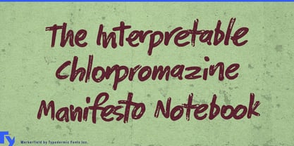
Markerfield works best when it behaves like markup rather than carefully composed typography: relatively small, loosely placed, occasionally angled, and positioned just outside the underlying grid. It gives polished digital work a human intervention layer while keeping every note editable and repeatable.

Designers: Ray Larabie

Foundry: Typodermic

MyFonts debut: Apr 13, 2010

Markerfield

About Typodermic

Welcome to Typodermic Fonts, a spirited type foundry rooted in Nagoya, Japan, started by the Canadian typeface designer, Raymond Larabie in 2001. Our library brims with 500+ diverse typefaces to fuel creativity in graphic design, advertising, web, and app development. As digital type pioneers, we adopted web fonts and app licensing early, consistently pushing the design envelope. With Canadian heart and Japanese precision, we're your global partners in extraordinary typography. Explore Typodermic Fonts—where creativity meets character.

Read more

Read less
