Hello, and welcome to the REN FONT foundry!
REN FONT has steadily built its reputation by repeatedly earning accolades in the Typeface category of the “Yearbook,” an exhibition organized by the Japan Typography Association (NPO). Founded in 2001 with the aim of bringing a fresh breeze to the font industry, REN FONT continues to create distinctive typefaces that stand out.
The hand-drawn-style fonts crafted by REN FONT’s type designer, Kazuo Kanai, have received high praise from professional designers and typographers for their exceptional quality.
A Message from Kazuo Kanai
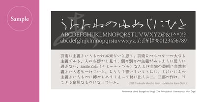
With the exception of our comprehensive typeface Waon, our company has been particularly dedicated to producing kana fonts in the traditional Mincho and Gothic styles. Most of these fonts have been developed as multi-weight families — and there’s a good reason for that.
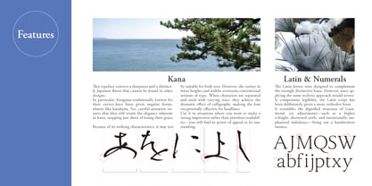
In Japanese text, kana characters account for roughly 70% of the total. Even so, kana fonts have little significance on their own; it is only when combined with kanji that they take on “meaning” and come to life.
Most vendors offer font weights in seven to nine variations, from “Light” to “Ultra,” but there are no universal standards for these weight categories — each vendor defines them differently. As a result, a “Light” weight from one vendor may differ subtly in thickness from another. For kana fonts to pair harmoniously with such variations and truly come alive, a finer gradation of weights is essential.
This is why our kana fonts feature such detailed weight variations.
Simply changing the kana can greatly enrich the expression of a typeface.
We hope you will make the most of our kana fonts, blending them freely with other typefaces to create combinations that perfectly suit your taste.
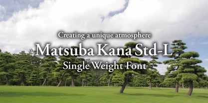
Exuding a Unique Atmosphere
Matsuba Kana Std-L
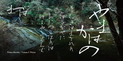
松葉かな Std-L (Matsuba Kana Std-L) is based on “Matsuba-L,” a typeface selected in the Typeface category of the “Japan Typography Annual 2003” competition organized by the Japan Typography Association in 2003.
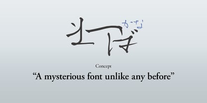
This playful work was created by our type designer, Kazuo Kanai, who, while experimenting with how to hold a brush pen during the development of a new typeface, discovered a special writing technique that takes advantage of the pen’s elasticity—and completed the design in one burst of inspiration. The name “Matsuba” (“Pine Needle”) comes from the resemblance of the character shapes to pine needles.
Within its rugged, unusual shapes lies the designer’s dedication to the beauty of Japanese aesthetics, giving the typeface a distinctive flavor unlike any other.