Skip to content
Skip to main content

Meloriac

by Typodermic
Individual Styles from $69.95 USD
The Meloriac Font Family was designed by Ray Larabie and published by Typodermic. Meloriac contains 1 styles. More about this family

About the family


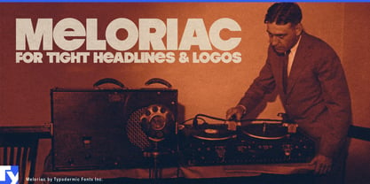
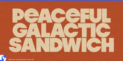
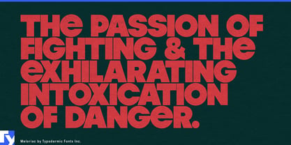
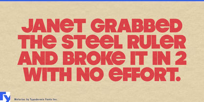
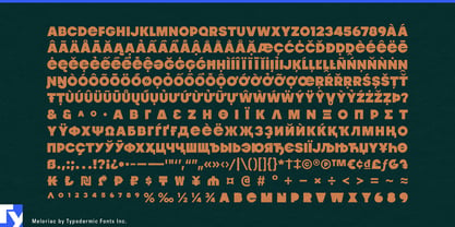
Ultra-heavy geometric sans serifs are everywhere now, but many still behave like ordinary type: big individual letters separated by ordinary spaces. Meloriac is built differently. Its almost-unicase forms, near-closed counters and tight-but-not-touching spacing compress short words into dense geometric objects.

That spacing draws on the tightly fitted display typography common from the mid-1970s into the 1980s, when letters were pushed close enough for the negative spaces between them to become part of the composition. Meloriac combines that approach with enormous weight, broad curves and a distinctive lowercase e that keeps the geometry from becoming too predictable.

Short names are where it thrives. On soda cans, ice-cream tubs, chocolate wrappers and cereal boxes, a brand or flavour name can occupy the package almost like an illustration. The same packed geometry has an affinity with modular sofas, molded furniture, squat lamps and vintage hi-fi equipment, making Meloriac useful for furniture showrooms, lighting collections, audio shops and product model names. Construction toys and modular play products offer another natural home for letters that look almost assembled from oversized components.

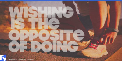
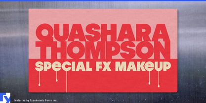
The same economy of space gives Meloriac a thoroughly current job in YouTube thumbnails and video title cards, where two or three words have to remain forceful after the image shrinks to phone size. Brand names, model names, flavour names, thumbnail headlines and exhibition titles all benefit from its ability to turn a few letters into one substantial shape; pair it with something quieter for the information around them.

Designers: Ray Larabie

Foundry: Typodermic

Original Foundry: Typodermic

MyFonts debut: Mar 8, 2007

Meloriac

About Typodermic

Welcome to Typodermic Fonts, a spirited type foundry rooted in Nagoya, Japan, started by the Canadian typeface designer, Raymond Larabie in 2001. Our library brims with 500+ diverse typefaces to fuel creativity in graphic design, advertising, web, and app development. As digital type pioneers, we adopted web fonts and app licensing early, consistently pushing the design envelope. With Canadian heart and Japanese precision, we're your global partners in extraordinary typography. Explore Typodermic Fonts—where creativity meets character.

Read more

Read less
