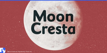
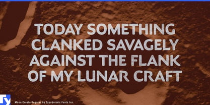
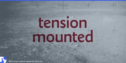
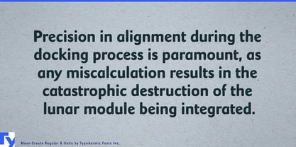
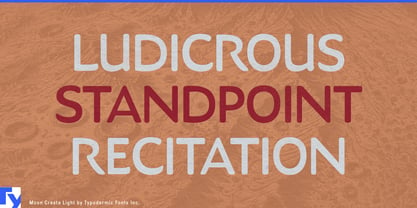
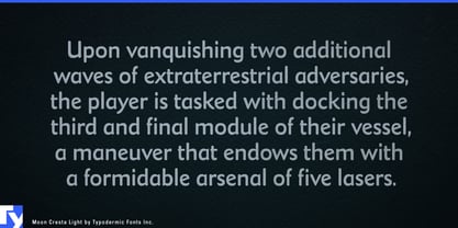
An approachable sans serif can become generic surprisingly quickly: circles, capsules, rounded corners, and immaculate geometry. Moon Cresta takes a more human route. Inspired by Fredric Goudy’s overlooked sans serif, it retains the uneven rhythm and calligraphic logic of hand-shaped letters, then smooths the forms into a clean contemporary display face. Softened terminals and gently swelling curves make it friendly without pushing it toward children’s lettering.
That distinction is useful for museums, science centres, aquariums, botanical gardens, and other institutions that need to welcome a broad public without talking down to them. Moon Cresta can give a renewable-energy gallery, biodiversity exhibition, robotics zone, planetarium programme, or ocean-conservation campaign an accessible voice across exhibition titles, visitor-map headings, membership graphics, family guides, and short interpretive copy.
The same human quality suits technology that has moved out of the laboratory and into everyday life. Home batteries, EV chargers, heat-pump controllers, air-quality monitors, kitchen appliances, sleep devices, and domestic robots all need identities that can explain sophisticated engineering without making the home feel like a control room. Moon Cresta works especially well around coordinated product families, where model names, launch headlines, packaging, onboarding graphics, and retail displays need consistency without the impersonal finish of a geometric tech sans.
Food offers another kind of system. A cultured-food range spanning yogurt, kefir, butter, and related products; a premium pantry collection of oils, grains, sauces, and preserves; or a national bakery line can use Moon Cresta to suggest something handled and made while remaining orderly enough for many products and varieties. Its calligraphic understructure supplies warmth without relying on handwriting or rustic nostalgia.
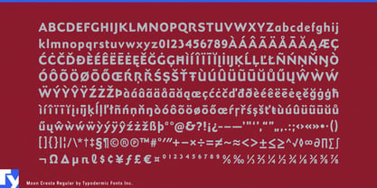
Small details reinforce its hand-shaped character, including KA and RA ligatures and a selection of refined f combinations for names and display words that benefit from closer attention.
Moon Cresta’s name comes from a classic arcade game, but its strongest contemporary uses are considerably more terrestrial. Its humanist construction gives public institutions, domestic technology, food systems, and other audience-facing projects an alternative to the increasingly familiar vocabulary of rounded geometric sans serifs.