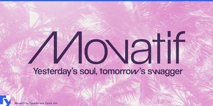
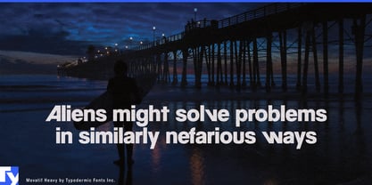
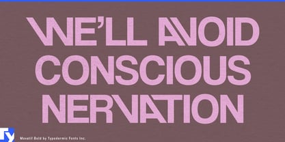
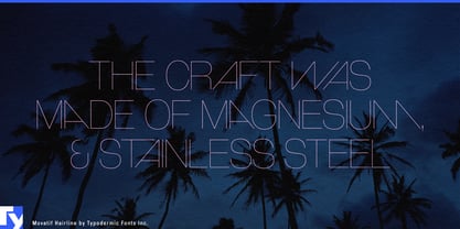
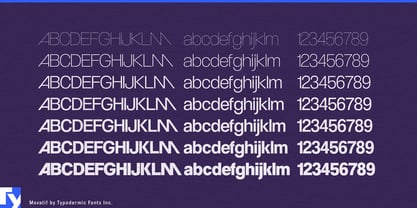
Fictional companies often look fictional for the wrong reason. Set their names in a neutral sans and they resemble placeholders; give them overtly futuristic lettering and they seem to have been invented yesterday. A believable near future needs brands with visual baggage, as though they have survived old campaigns, acquisitions, product launches and several imperfect redesigns. Movatif gives an imaginary corporation a past.
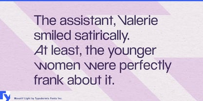
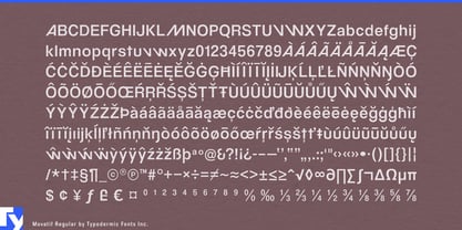
Its geometric foundation feels familiar, but the details keep slipping out of place. Tight spacing, diagonal joins and integrated ligatures pull selected letter combinations into compact, wordmark-like structures. The result resembles a half-remembered logo from an alternate timeline: professionally designed, recognizably modern and difficult to place with certainty.
That temporal ambiguity is useful in near-future films, games and episodic productions. Biotechnology companies, private research institutes, transport operators, consumer-electronics manufacturers, wellness campuses and property developers all need identities that appear to predate the story. Movatif can establish the central company name, then extend across facility signs, employee badges, vehicle markings, product cartons, orientation films, recruitment graphics and internal presentations.
Its polished surface is particularly effective in corporate dystopias and institutional thrillers. A fictional employer, private hospital, artificial-intelligence laboratory or employee-optimization service may need to look reassuring at first glance. Movatif supplies the smooth geometry; its unexpected joins introduce a slight structural wrongness without announcing the organization as sinister.
Large fictional worlds create a practical production problem. A studio may need a parent company, several subsidiaries, research divisions, product families and branded devices, each convincing enough to appear on screen for only a few seconds. Commissioning custom lettering for every minor organization is inefficient, while setting every name in the same ordinary sans flattens the world. Movatif’s ligatures give different words distinct silhouettes while preserving a shared corporate design culture. One family can suggest a conglomerate, an era or an entire layer of commercial history.
The mixed-case forms carry that identity beyond the central wordmark. Department names, campaign headings, short slogans, environmental graphics and fictional advertisements can retain the same subtly altered logic; a quieter companion face can handle contracts, technical data and dense interface text.
Movatif is most useful when a fictional world needs evidence of its own recent past. It gives invented companies the polished, slightly timeworn identity of organizations that were already in business before the story began.