Skip to content
Skip to main content

Neospace Expanded

by deFharo
Individual Styles from $10.00 USD
Complete family of 6 fonts: $90.00 USD
The Neospace Expanded Font Family was designed by Fernando Haro and published by deFharo. Neospace Expanded contains 6 styles and family package options. More about this family

About the family


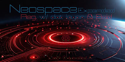
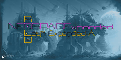
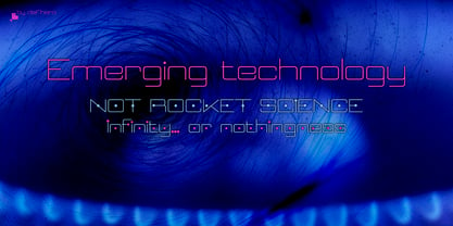
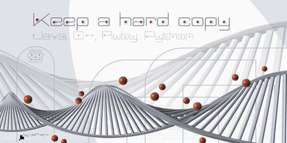
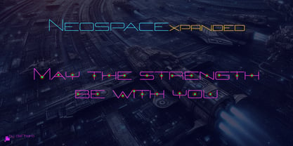
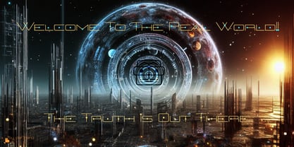
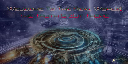
Neospace Expanded is an avant-garde typeface designed for technology and science fiction lovers. With its elegant geometric minimalism, Neospace redefines typographic aesthetics with a perfect fusion between modern and futuristic.

  • Geometric Inspiration

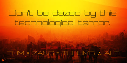
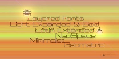
Designed with an expanded proportion and thin thickness, it exudes its own high-tech, futuristic and space style. Each Neospace character has been sculpted from the letter “O”, using the mathematical proportions of the Fibonacci sequence in curves, metrics and kerning, adding a golden ratio to each character. This meticulous approach ensures exceptional readability and a unique aesthetic that evokes a sense of order and precision.

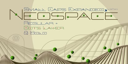
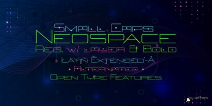
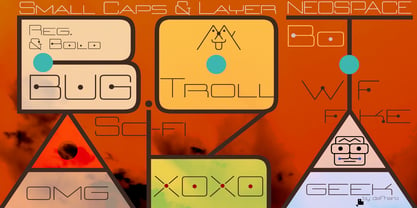
Three styles: Regular, which provides a modern and clean look; the Dot Layer, which adds a touch of color and creativity to typographic titles; and the Bold version, which evokes the feeling of futuristic and sophisticated electronic circuits, bringing a sense of avant-garde and advanced technology to your projects.

Neospace allows you to create typographic titles in various colors, imitating the sophistication of futuristic electronic circuits.

  • Limitless Versatility

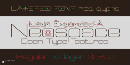
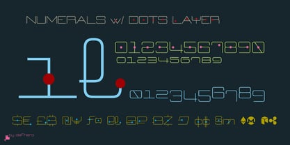
Neospace goes further by offering alternative letters and signs, multiple sets of numbers and capital letters, as well as monetary and cryptocurrency symbols. In addition, it incorporates complex OpenType functions that further enrich the design possibilities, allowing even greater customization in your typographic designs.

Designers: Fernando Haro

Foundry: deFharo

MyFonts debut: Nov 16, 2023

Neospace Expanded

About deFharo

deFharo is the independent type foundry of Spanish graphic and type designer Fernando Haro. With more than 30 years of experience in graphic and advertising design and over a decade devoted to typeface design, Fernando Haro has developed an eclectic body of work that ranges from editorial and corporate typefaces to expressive display, geometric, technological, retro and experimental designs. His approach combines visual character with typographic functionality. Every typeface begins with drawing, proportion and a clear visual idea, and evolves through meticulous work on spacing, metrics, kerning, optical corrections and OpenType features. Rather than following a single recognizable style, deFharo explores different typographic territories according to the personality and purpose of each project. Some families are designed for long-form reading and editorial systems; others are built for branding, headlines, packaging, signage or highly expressive graphic compositions. A strong interest in vector drawing, typographic systems and functional design runs throughout the collection. Alternative characters, small caps, Petite Caps, fractions, numerals, ligatures, symbols and extended language support are frequently developed as integral parts of the typeface rather than as afterthoughts. The result is a growing collection of typefaces designed to be both distinctive and useful — fonts with personality, but also with the technical precision required for professional graphic and editorial work. deFharo typefaces are designed by Fernando Haro and published independently from Spain.

Read more

Read less