Skip to content
Skip to main content

Nesobrite

by Typodermic
Individual Styles from $69.95 USD
Complete family of 50 fonts: $169.95 USD
The Nesobrite Font Family was designed by Ray Larabie and published by Typodermic. Nesobrite contains 50 styles and family package options. More about this family

Nesobrite Complete Family

50 fonts

Best Value!

Per Style:

$3.39 USD

Pack of 50 styles:

$169.95 USD

See 40 more See less

About the family


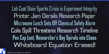
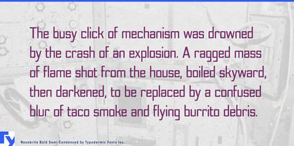
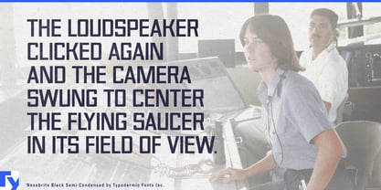
Technical typography does not always benefit from getting heavier. On an instrument panel, laboratory system, diagnostic interface, or precision device, an oversized black weight can overpower the readings, diagrams, controls, and status information that actually matter. Nesobrite takes a more measured approach. Its square construction provides a strong technological identity, but even the darkest styles remain relatively open, creating emphasis without turning every heading into a block of ink.

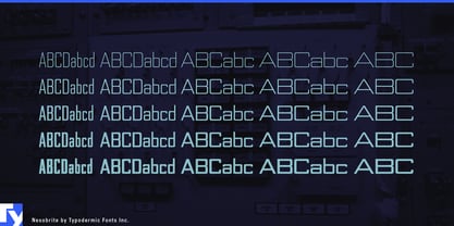
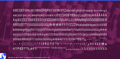
Rigid verticals, squared bowls, a tall x-height, and modular forms give words an engineered rhythm. Multiple widths and matching italics let that structure adapt across equipment fascia, narrow model names, presentation graphics, software headings, and technical diagrams. The range moves from fine analytical display typography to controlled heavy emphasis rather than chasing extreme weight.

Laboratory automation and scientific equipment are especially natural settings. Sample handlers, chromatography systems, spectroscopy instruments, environmental analyzers, materials-testing equipment, and laboratory robots all need typography for model names, platform labels, touchscreen headings, technical brochures, and conference displays. Nesobrite can distinguish the equipment family without competing with graphs, measurements, controls, and other functional information.

Biotechnology extends the same language into cell-analysis platforms, sequencing systems, synthetic-biology tools, automated bioprocessing, and laboratory data systems. Semiconductor testing and precision electronics provide another strong fit: wafer-inspection systems, probe stations, photonics instruments, RF measurement equipment, calibration systems, and precision power supplies often combine long model names with narrow panels and dense diagrams. Nesobrite’s width range lets those names compress when necessary without abandoning the larger visual system.

Space operations offer a related territory without requiring sci-fi theatrics. Satellite control systems, telemetry platforms, ground stations, tracking equipment, earth-observation systems, and spacecraft testing all need subsystem names, status headings, equipment labels, mission graphics, and technical presentations. Medical devices, building automation, process monitoring, and environmental-control systems can use the same restrained technical voice.

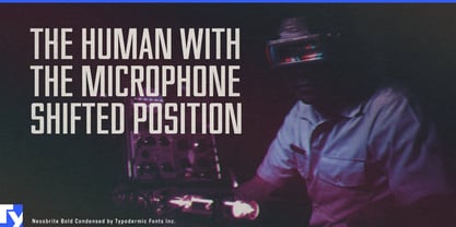
For entertainment, Nesobrite can shift from engineering into procedure. Forensic thrillers, surveillance dramas, scientific mysteries, and investigation games can use its narrower styles for case numbers, evidence-system headings, map overlays, dossier graphics, and analytical interfaces.

Nesobrite is not built around brute-force display weight. Its strength is controlled emphasis: an engineered display voice for laboratories, precision electronics, space operations, medical devices, industrial controls, and other information-rich technical environments.

Designers: Ray Larabie

Foundry: Typodermic

MyFonts debut: Mar 7, 2007

Nesobrite

About Typodermic

Welcome to Typodermic Fonts, a spirited type foundry rooted in Nagoya, Japan, started by the Canadian typeface designer, Raymond Larabie in 2001. Our library brims with 500+ diverse typefaces to fuel creativity in graphic design, advertising, web, and app development. As digital type pioneers, we adopted web fonts and app licensing early, consistently pushing the design envelope. With Canadian heart and Japanese precision, we're your global partners in extraordinary typography. Explore Typodermic Fonts—where creativity meets character.

Read more

Read less