Select this license type when you are developing an app for iOS, Android, or Windows Phone, and you will be embedding the font file in your mobile application's code.
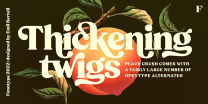
Peach Crush
by Fenotype
Individual Styles from $25.00

Peach Crush Font Family was
designed by
Emil Karl Bertell and
published by
Fenotype. Peach Crush contains
1
styles.
More about this family
About Peach Crush Font Family
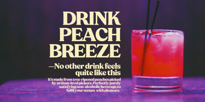
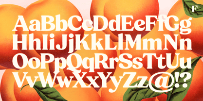
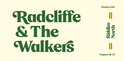
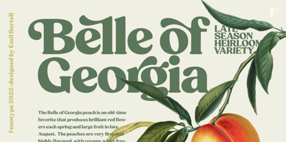
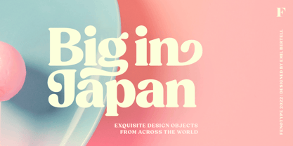
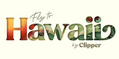
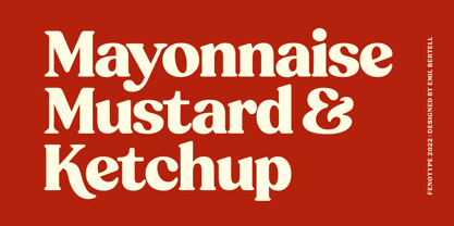
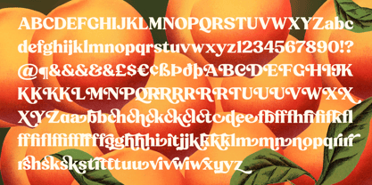
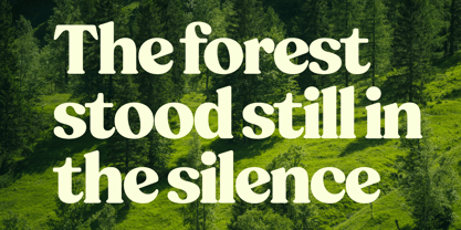
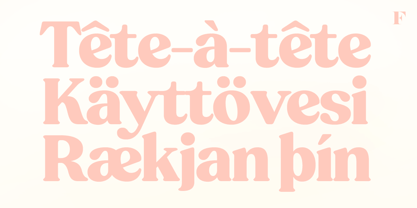
Peach Crush is a bold vintage style serif font with a soft charm and smooth features. Peach Crush delivers a reminiscence of a familiar and warm nostalgic feeling.
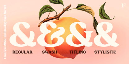
Peach Crush is equipped with Contextual, Swash, Stylistic and Titling alternates as well as Discretionary Ligatures and even more extra alternates. All these features can be accessed by OpenType controls or straight from Character or Glyphs window. Contextual Alternates and Standard Ligatures are automatically on and they simply do small changes to prevent certain character collisions. Other features are optional and can be used for bolder design solutions. Peach Crush has a total number of 115 alternate characters, even Swash Alternates for certain Standard and Discretionary Ligatures such as ch, ck, sh, sk, ff, fl and fi.
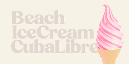
Peach Crush is a great typeface for contemporary graphic design with that certain feeling of familiarity. It works well on logos, packaging, restaurant graphics, or any display use, as well as in headlines or shorter texts. Try Peach Crush with reduced tracking for tighter word images, or if you want to use it in really small sizes add some tracking. Peach Crush is based on another Fenotype font, Tomato Ketchup but has more contrast and sharper serifs.
Designers: Emil Karl Bertell
Publisher: Fenotype
Foundry: Fenotype
Design Owner: Fenotype
MyFonts debut: Oct 7, 2022
Peach Crush
About Fenotype
Emil Bertell has done it all. Having published his first font files at 16, he was considered to be an international free-font hero while still in his teens. He went on to attend design college, drop out, and become a well-known graphic designer and illustrator. Now one of the most successful type designers from the Nordic countries on MyFonts, the Finland-based designer said in his Creative Characters interview that he’s “had an obsession with visual culture from the beginning.” Before turning his attention to type design full-time, Emil had a very successful career as an award-winning illustrator. “Illustration became my main livelihood,” he said. “I drew painstaking pencil illustrations for magazines, advertising, stamps, etc. I often designed my own fonts for festivals and hand-drew the lettering posters; I also did a few pencil illustrations based on lettershapes, and that got out of hand, so I had to do a lot more of them.” In 2012 he finally made the switch and committed all of his time to type design. Emil first saw success with his Billboard typeface. “It became my first Rising Star on MyFonts and made me realize that I could actually make a living by designing fonts,” he said. “I realized that there’s actually a market out there that I could become a part of.” Throughout the rest of that year he began to see even more success. It began in January, when his font, Mishka, was featured in our Most Popular Fonts of 2011 list. He went on to find a way to bookend the year and was listed among the Most Popular Fonts of 2012 with his Mercury Script design. Since then, his foundry’s success has continued on with best sellers like Voyage and The Carpenter. Fans of the foundry have a lot to look forward to in the near future. Emil will continue to produce beautiful scripts (some coming soon to MyFonts!) and has plans to expand his business.
Read more
Read less
- Choosing a selection results in a full page refresh.