Select this license type when you are developing an app for iOS, Android, or Windows Phone, and you will be embedding the font file in your mobile application's code.
Periplus
by PintassilgoPrints
About Periplus Font Family
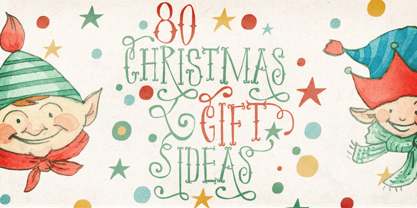
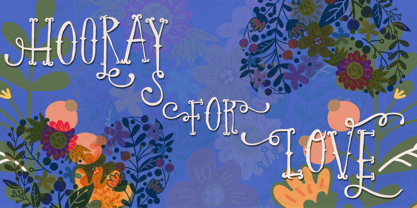
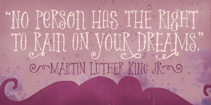
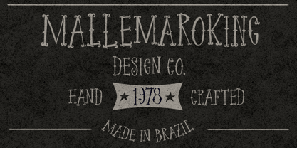
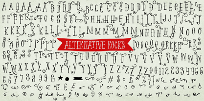
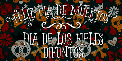
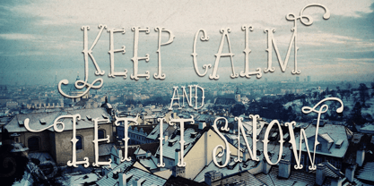
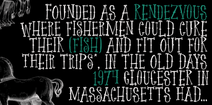
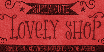
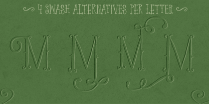
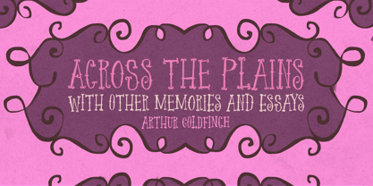
I got rhythm, I got music, I got my swirls, who could ask for anything more? Periplus is quite an eccentric type, full of twists and nice oddities here and there. It is an all-caps font with 2 variations for each letter and number, stored at upper- and lower-case slots. For added amusement, every letter got not 1 or 2, but 4 swash variations. One can be reached through the OpenType swash feature: just select the letter and hit the swash button. The other ones you will access through a glyphs palette. All of them are neatly organized with the 'access all alternates' feature. The font is yet equipped with some stylistic alternates and ornaments. Have fun!
Designers: Erica Jung, Ricardo Marcin
Publisher: PintassilgoPrints
Foundry: PintassilgoPrints
Original Foundry: unknown
Design Owner: PintassilgoPrints
MyFonts debut: Jan 1, 2014
About PintassilgoPrints
Their first commercial font is from 2009. And it didn’t take long for PintassilgoPrints typefaces to be picked by creatives to speak for brands such as McDonald's, Starbucks, Cartoon Network, Jamie Oliver, Hasbro, Mattel, Gap, Taschen, Rovio and others. Check out examples of the foundry's fonts in use here. With a strong background in hand printing techniques, PintassilgoPrints has been developing a consistent and original library, with fonts ranking to our best-selling list and Rising Star issues. Their work was also featured in printed magazines and books such as Computer Arts, Page Magazine, Slanted, PicNic, Typolyrics, Typodarium, The Yearbook of Type. The foundry was interviewed for our Creative Characters newsletter as well as for the prestigious 8 Faces Magazine. PintassilgoPrints fonts are often packed with many alternative glyphs and a clever touch of OpenType programming. Their typefaces mostly reflect a vigorous handcrafted feel, seasoned with some 'je ne sais quoi' that decidedly works. Horst was their first Best Seller and Rising Star font, the same route taken by Monstro and Populaire. This ubiquitous one also made it to the Most Popular Fonts of 2011 list. Now established in Florianópolis, an island city in Brazil, the foundry is run by Ricardo Marcin and Erica Jung, who also share life, kids and a long time love of typography, graphic arts, music and sun. By the time of their interview for Creative Characters they were based in Vitória, curiously also an island. Definitely many more sunshiny fonts are yet to come from PintassilgoPrints. Stay tuned!The premium foundry page can be viewed Here.
Read more
Read less
- Choosing a selection results in a full page refresh.