Select this license type when you are developing an app for iOS, Android, or Windows Phone, and you will be embedding the font file in your mobile application's code.
Pieches
by PintassilgoPrints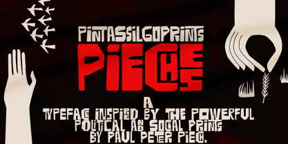
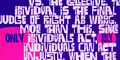
About Pieches Font Family
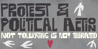
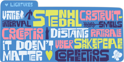
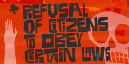
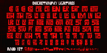
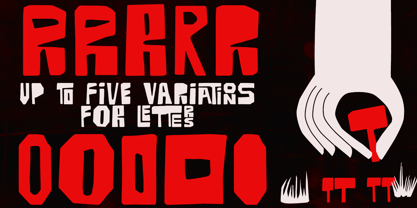
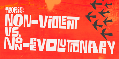
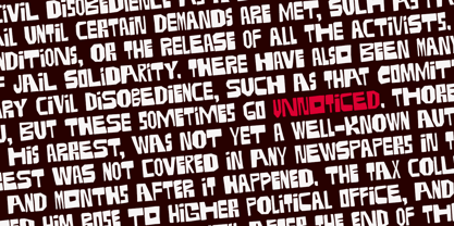
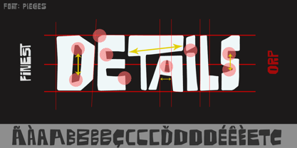
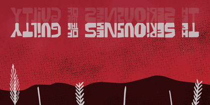
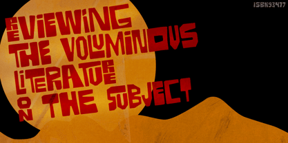
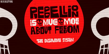
This typeface is inspired by the powerful political and social posters by Paul Peter Piech, a tireless artist and printer. Questioned about his endless energy and focus on work, he said "I don't want to sit around and be silent". Pieches is a linocut-looking font heavily loaded with interlocks, including vertical pairs of letters. There are alternates also, and not quite a few: four glyphs for each letter so countless expressive possibilities are open. Graphical elements are also included, for added wilderness. This is a loud-speaking font for those who don't want to be silent. Come on, let’s shout!
Designers: Erica Jung, Ricardo Marcin
Publisher: PintassilgoPrints
Foundry: PintassilgoPrints
Design Owner: PintassilgoPrints
MyFonts debut: Aug 9, 2019
About PintassilgoPrints
Their first commercial font is from 2009. And it didn’t take long for PintassilgoPrints typefaces to be picked by creatives to speak for brands such as McDonald's, Starbucks, Cartoon Network, Jamie Oliver, Hasbro, Mattel, Gap, Taschen, Rovio and others. Check out examples of the foundry's fonts in use here. With a strong background in hand printing techniques, PintassilgoPrints has been developing a consistent and original library, with fonts ranking to our best-selling list and Rising Star issues. Their work was also featured in printed magazines and books such as Computer Arts, Page Magazine, Slanted, PicNic, Typolyrics, Typodarium, The Yearbook of Type. The foundry was interviewed for our Creative Characters newsletter as well as for the prestigious 8 Faces Magazine. PintassilgoPrints fonts are often packed with many alternative glyphs and a clever touch of OpenType programming. Their typefaces mostly reflect a vigorous handcrafted feel, seasoned with some 'je ne sais quoi' that decidedly works. Horst was their first Best Seller and Rising Star font, the same route taken by Monstro and Populaire. This ubiquitous one also made it to the Most Popular Fonts of 2011 list. Now established in Florianópolis, an island city in Brazil, the foundry is run by Ricardo Marcin and Erica Jung, who also share life, kids and a long time love of typography, graphic arts, music and sun. By the time of their interview for Creative Characters they were based in Vitória, curiously also an island. Definitely many more sunshiny fonts are yet to come from PintassilgoPrints. Stay tuned!The premium foundry page can be viewed Here.
Read more
Read less
- Choosing a selection results in a full page refresh.