A lot of contemporary technology revolves around live numbers: charging power, lap time, battery percentage, speed, watts, temperature, energy flow, distance, and remaining time. Literal segment-display lettering makes those values feel immediate, but it becomes awkward as soon as the designer needs actual language around them. Switch to an ordinary geometric sans and the words become easier to handle, but the connection to the measured data disappears.
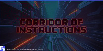
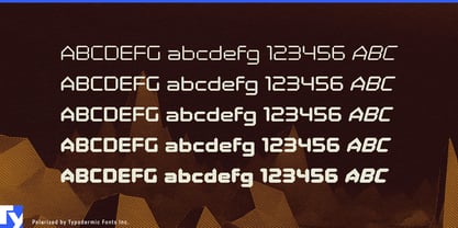
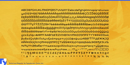
Polarized bridges those two worlds. Its construction comes from segmented electronic lettering, but pointed stroke endings replace the blunt overlaps of conventional display segments. The result retains the visual logic of an LCD readout while behaving like a full mixed-case typeface. Numbers still look measured, timed, charged, or monitored; headings, product names, status words, and short phrases can belong to the same system.
Ultra-fast EV charging is a particularly strong fit. Charging screens and launch graphics revolve around kilowatts, battery percentage, kilowatt-hours, session time, and remaining charge. Polarized can carry those figures alongside words such as Charging, Available, Complete, Connector, and Maximum Power without making the interface look like a blown-up calculator. The same language can extend to charging-network identities, depot-charging demonstrations, megawatt truck-charging presentations, and trade-show displays.
Motorsport timing and telemetry provide another natural setting. Lap times, sector differences, speed, position, and live performance data need to be read quickly while still contributing to the visual identity of a broadcast or event. Polarized can handle timing towers, qualifying clocks, telemetry panels, pit-wall graphics, simulator overlays, and broadcast stat cards.
Connected training equipment uses the same vocabulary of measured values. Smart trainers, cycling computers, rowing machines, performance treadmills, and sports-science systems revolve around watts, cadence, split times, distance, heart rate, resistance, and interval countdowns. Polarized can give those numbers an instrument-like presence while keeping workout names, training zones, and mode headings visually connected.
Microgrids and distributed-energy systems turn another set of changing values into the center of the display: current generation, battery state of charge, site demand, imported and exported power, storage output, and system status. Polarized works naturally in energy-flow visualizations, public building-energy displays, battery-storage demonstrations, and solar-plus-storage graphics.
Test and measurement equipment extends the idea into laboratories and engineering. Battery cyclers, power analyzers, optical meters, environmental test systems, and data-acquisition equipment all generate values that should look like readings rather than ordinary text. Polarized can handle prominent measurements, mode names, test-result graphics, and instrument presentations while a quieter text face handles dense instructions and analysis.
Polarized is most useful when the number itself is part of the spectacle: a charging rate climbing, a lap time dropping, battery capacity changing, watts increasing, or energy moving through a system. It gives the language around those values the same measured electronic character instead of treating the readout and the words as unrelated visual systems.