



Skip to content
Skip to main content

Quasix

by Typodermic
Individual Styles from $69.95 USD
The Quasix Font Family was designed by Ray Larabie and published by Typodermic. Quasix contains 1 styles. More about this family

About the family


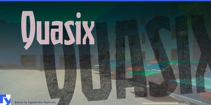
Quasix finds beauty in machinery that was never expected to be seen. Its indirect inspiration came from the inside of a VCR: an intricate assembly of stamped brackets, moulded gears, springs, guides, levers, and oddly shaped components. Each part was designed to perform a specific task, fit around its neighbours, satisfy manufacturing constraints, and keep the tape moving. The mechanism is beautiful because it works.

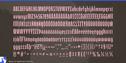
The same principle governs Quasix. Its condensed letterforms appear to have been assembled from locally optimized solutions rather than derived from one elegant geometric recipe. A joint bends because that letter requires it; a bowl meets its stem at an awkward angle; a diagonal is clipped, braced, or redirected according to the available space. Individual decisions seem incompatible, but their recurring economy gives the alphabet its cohesion. The disharmony is systematic.

Quasix resembles typographic kitbashing. Model builders create convincing machines by combining vents, housings, panels, and structural fragments taken from unrelated kits. The original purpose of each component disappears, but the accumulation of functional-looking parts makes the completed object plausible. Quasix similarly suggests that every peculiar joint has a purpose, even when that purpose remains inaccessible to the viewer.

This makes Quasix useful for subjects involving repair, fabrication, and the hidden lives of ordinary machines: electronics teardown videos, right-to-repair campaigns, consumer-technology exhibitions, e-waste programmes, hardware kits, robot competitions, fabrication workshops, experimental instruments, and publications about industrial design. Its eccentric construction can support model numbers, equipment labels, section headings, and event graphics without resorting to literal gears or circuit traces.

The kitbashed quality also gives fictional machinery a credible visual culture. Quasix suits patched spacecraft, salvage-built robots, improvised transmitters, eccentric vehicles, and obsolete equipment kept alive with incompatible parts. It can shape machine classifications, vehicle names, equipment decals, model-kit boxes, tabletop campaign titles, and chapter headings in illustrated science fiction.

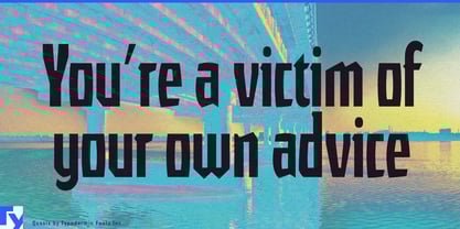
Beyond engineering, Quasix’s compressed proportions and unsettled rhythm suit post-punk flyers, noise-rock releases, experimental dance nights, fringe theatre, surreal animation, and found-object sculpture exhibitions. Its lowercase allows that peculiar logic to accumulate across names, headlines, labels, and short blocks of text; longer phrases gradually reveal that the inconsistencies are following rules after all.

Every part looks questionable in isolation. Together, they make the machine run.

Designers: Ray Larabie

Foundry: Typodermic

Original Foundry: Typodermic

MyFonts debut: Jan 10, 2006

Quasix

About Typodermic

Welcome to Typodermic Fonts, a spirited type foundry rooted in Nagoya, Japan, started by the Canadian typeface designer, Raymond Larabie in 2001. Our library brims with 500+ diverse typefaces to fuel creativity in graphic design, advertising, web, and app development. As digital type pioneers, we adopted web fonts and app licensing early, consistently pushing the design envelope. With Canadian heart and Japanese precision, we're your global partners in extraordinary typography. Explore Typodermic Fonts—where creativity meets character.

Read more

Read less
