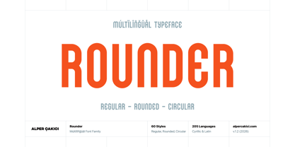
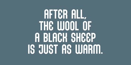
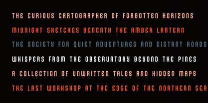
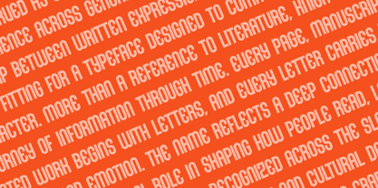
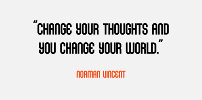
Rounder is a bold geometric sans serif built around a distinctive combination of rigid construction, rounded terminals, and tightly controlled geometric forms. Its letters are tall, compact, and highly graphic, creating a strong visual rhythm while maintaining a surprisingly clean and coherent appearance.
The design balances hard-edged geometric structure with rounded, almost tubular curves. Vertical stems remain powerful and consistent, while arches, bowls, and terminals introduce a softer character. This contrast gives Rounder its distinctive identity: futuristic and architectural without becoming overly mechanical.
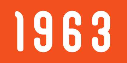
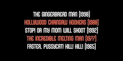
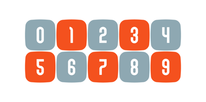
A particularly recognizable feature is the way the rounded construction interacts with sharp geometric cuts and unusual internal shapes. Characters such as A, B, C, G, R, S, U, W, X, Y, and Z create a strong display personality, while the numerals follow the same compact, modular language. The result is a typeface that feels especially effective at large sizes, where its construction and details become immediately visible.
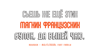
Rounder includes 60 instances, providing an extensive collection of stylistic variations. Alongside the core Regular and Italic styles, the family includes Circular, Rounded, Edgy, Aged, Rough, Outline, Inline, Shadow, Rimmed, and combined treatments such as Inline Shadow and Rimmed Shadow. These variations allow the same underlying design to move between clean typography, distressed graphics, dimensional lettering, and more experimental display compositions.
The Circular and Rounded versions push the softer side of the design, emphasizing smooth curves and a more approachable geometric appearance. Edgy introduces a sharper and more angular interpretation, while Aged and Rough add texture and an imperfect printed character. Inline, Outline, Rimmed, Shadow, Inline Shadow, and Rimmed Shadow provide additional tools for creating layered and dimensional typography without requiring separate graphic treatments.
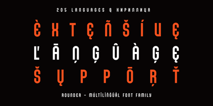
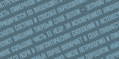
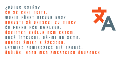
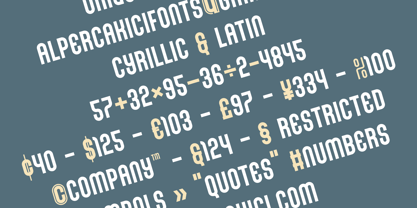
With 549 glyphs and Cyrillic & Latin support, Rounder is designed for multilingual display typography as well as Latin-based projects. Its OpenType features include localized forms for multiple languages and Cyrillic writing systems, together with fractions, ordinals, superscripts, subscripts, and stylistic alternates. This makes the family more versatile for professional typographic work than its highly distinctive display appearance might initially suggest.
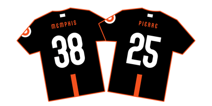
Rounder is particularly well suited to posters, headlines, titles, logos, branding, editorial covers, packaging, music artwork, sports graphics, gaming interfaces, motion graphics, advertising, social media artwork, and futuristic visual identities. Its compact proportions make it effective when strong impact is required within limited horizontal space, while the extensive style selection makes it possible to build complete visual systems around a single typeface family.
Designed for both screen and print, Rounder works especially well when typography is treated as a graphic element. At large display sizes, its rounded geometry, unusual counters, and carefully constructed forms become a central part of the composition. The multiple outline, inline, rimmed, shadow, aged, and rough variations further extend its usefulness for expressive visual applications.
Rounder combines geometric precision, rounded construction, compact proportions, and experimental display character in one extensive 60-style family.