Hello, and welcome to the REN FONT foundry!
REN FONT has steadily built its reputation by repeatedly earning accolades in the Typeface category of the “Yearbook,” an exhibition organized by the Japan Typography Association (NPO). Founded in 2001 with the aim of bringing a fresh breeze to the font industry, REN FONT continues to create distinctive typefaces that stand out.
The hand-drawn-style fonts crafted by REN FONT’s type designer, Kazuo Kanai, have received high praise from professional designers and typographers for their exceptional quality.
A Message from Kazuo Kanai
With the exception of our comprehensive typeface Waon, our company has been particularly dedicated to producing kana fonts in the traditional Mincho and Gothic styles. Most of these fonts have been developed as multi-weight families — and there’s a good reason for that.
In Japanese text, kana characters account for roughly 70% of the total. Even so, kana fonts have little significance on their own; it is only when combined with kanji that they take on “meaning” and come to life.
Most vendors offer font weights in seven to nine variations, from “Light” to “Ultra,” but there are no universal standards for these weight categories — each vendor defines them differently. As a result, a “Light” weight from one vendor may differ subtly in thickness from another. For kana fonts to pair harmoniously with such variations and truly come alive, a finer gradation of weights is essential.
This is why our kana fonts feature such detailed weight variations.
Simply changing the kana can greatly enrich the expression of a typeface.
We hope you will make the most of our kana fonts, blending them freely with other typefaces to create combinations that perfectly suit your taste.
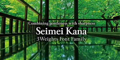
Gentleness Combined with Sharpness
Seimei Kana 3-Weight Font Family
Gentleness Combined with Sharpness
The name 清明かな (Seimei Kana) comes from the fifth of the 24 seasonal divisions (nijūshi sekki), symbolizing the time of year when the breath of spring overflows and “all things are pure and vibrant with life.” True to its name, this typeface mysteriously blends elegance and warmth within its crisp, flowing strokes. It also carries the nuance of “a refreshing Mincho.”
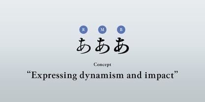
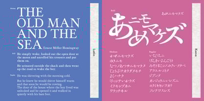
Based on the everyday handwriting of our type designer Kazuo Kanai, Seimei Kana embodies a complex mix of Mincho, semi-cursive (gyōsho), and regular-script (kaisho) forms. The family is composed of three weights—Regular (R), Medium (M), and Bold (B). While retaining a touch of old-style charm, it is designed with large kana that are not bound by traditional concepts, making it versatile for use in modern typesetting.
Expressing Vitality and Appeal
Each style in the Seimei Kana family was developed to help creative work convey both vitality and impact. Japanese fonts often lose fluidity when confined to square character boxes, but this typeface is designed with a freer approach, unbound by strict squareness.
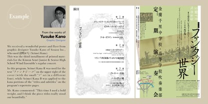
Because of its strong personality, it is not suited for long passages of text, but it works beautifully for short copy or subheadings, bringing pages to life with vibrancy and persuasive power. Proportional adjustments have been applied to both vertical and horizontal typesetting, and kerning pairs have also been fine-tuned.