Hello, and welcome to the REN FONT foundry!
REN FONT has steadily built its reputation by repeatedly earning accolades in the Typeface category of the “Yearbook,” an exhibition organized by the Japan Typography Association (NPO). Founded in 2001 with the aim of bringing a fresh breeze to the font industry, REN FONT continues to create distinctive typefaces that stand out.
The hand-drawn-style fonts crafted by REN FONT’s type designer, Kazuo Kanai, have received high praise from professional designers and typographers for their exceptional quality.
A Message from Kazuo Kanai
With the exception of our comprehensive typeface Waon, our company has been particularly dedicated to producing kana fonts in the traditional Mincho and Gothic styles. Most of these fonts have been developed as multi-weight families — and there’s a good reason for that.
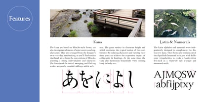
In Japanese text, kana characters account for roughly 70% of the total. Even so, kana fonts have little significance on their own; it is only when combined with kanji that they take on “meaning” and come to life.
Most vendors offer font weights in seven to nine variations, from “Light” to “Ultra,” but there are no universal standards for these weight categories — each vendor defines them differently. As a result, a “Light” weight from one vendor may differ subtly in thickness from another. For kana fonts to pair harmoniously with such variations and truly come alive, a finer gradation of weights is essential.
This is why our kana fonts feature such detailed weight variations.
Simply changing the kana can greatly enrich the expression of a typeface.
We hope you will make the most of our kana fonts, blending them freely with other typefaces to create combinations that perfectly suit your taste.
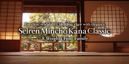
A Kana Mincho Font with Excellent Legibility, Combining Dynamism and Elegance
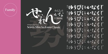
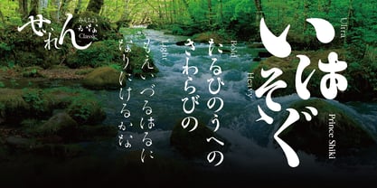
Seiren Mincho Kana Classic 8-Weight Font Family
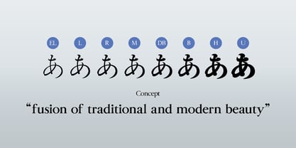
Each typeface in the 勢蓮明朝仮名Classic (Seiren Mincho Kana Classic) family is an enhanced, multi-weight version of the award-winning “Seiren Mincho-M,” which was selected in the Typeface category of the Japan Typography Annual 2001 competition, organized in 2001 by the Japan Typography Association (NPO). This updated version adds multiple weights as well as accompanying Latin characters, punctuation marks, and symbols.
Based on the everyday handwriting of our type designer, Kazuo Kanai, this typeface blends the intricate form impressions of Mincho, semi-cursive (Gyosho), and regular (Kaisho) brush styles. The family consists of a total of eight weights, from the lightest “L (Light)” to the heaviest “U (Ultra).” While preserving an old-style feel, the design breaks away from conventional concepts, featuring large kana glyphs that adapt well to modern typesetting—making it highly versatile.
With brushstrokes full of energy and proportions that create a flowing, graceful rhythm, it delivers strong impact as a display font while also being suitable for body text. Its form maintains excellent legibility, bringing both distinctive dynamism and elegance to the printed page.