Hello, and welcome to the REN FONT foundry!
REN FONT has steadily built its reputation by repeatedly earning accolades in the Typeface category of the “Yearbook,” an exhibition organized by the Japan Typography Association (NPO). Founded in 2001 with the aim of bringing a fresh breeze to the font industry, REN FONT continues to create distinctive typefaces that stand out.
The hand-drawn-style fonts crafted by REN FONT’s type designer, Kazuo Kanai, have received high praise from professional designers and typographers for their exceptional quality.
A Message from Kazuo Kanai
With the exception of our comprehensive typeface Waon, our company has been particularly dedicated to producing kana fonts in the traditional Mincho and Gothic styles. Most of these fonts have been developed as multi-weight families — and there’s a good reason for that.
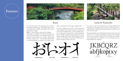
In Japanese text, kana characters account for roughly 70% of the total. Even so, kana fonts have little significance on their own; it is only when combined with kanji that they take on “meaning” and come to life.
Most vendors offer font weights in seven to nine variations, from “Light” to “Ultra,” but there are no universal standards for these weight categories — each vendor defines them differently. As a result, a “Light” weight from one vendor may differ subtly in thickness from another. For kana fonts to pair harmoniously with such variations and truly come alive, a finer gradation of weights is essential.
This is why our kana fonts feature such detailed weight variations.
Simply changing the kana can greatly enrich the expression of a typeface.
We hope you will make the most of our kana fonts, blending them freely with other typefaces to create combinations that perfectly suit your taste.
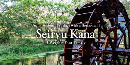
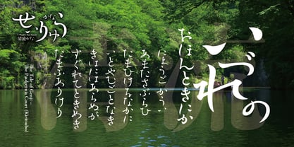
An unconventional typeface with a horizontal flow
Seiryu Kana 5-Weight Font Family
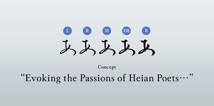
This typeface is based on the everyday lettering of our type designer Kazuo Kanai, enriched with the complex forms of Mincho and semi-cursive script. The family consists of five weights—L (Light), R (Regular), M (Medium), DB (DemiBold), and B (Bold).
While it retains an old-style impression, it is designed with large kana that break free from convention. This makes 清流かな (Seiryu Kana) a versatile font, equally at home in traditional-inspired compositions and modern layouts.
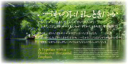
Pursuing the Beauty of Gentle Rhythms
A hybrid of Mincho elegance and semi-cursive fluidity, Seiryu Kana is a typeface designed for ultimate grace. Small counters in characters such as o, su, na, ne, ha are intentionally filled in to create “ink pools,” accentuating the smooth flow of handwritten script.
Among our fonts, its irregular body shapes are among the most extreme—yet this very unevenness produces a remarkable sense of organic rhythm. True to its name, Seiryu flows with the clarity and suppleness of pure water, offering both beauty and depth of expression.