Hello, and welcome to the REN FONT foundry!
REN FONT has steadily built its reputation by repeatedly earning accolades in the Typeface category of the “Yearbook,” an exhibition organized by the Japan Typography Association (NPO). Founded in 2001 with the aim of bringing a fresh breeze to the font industry, REN FONT continues to create distinctive typefaces that stand out.
The hand-drawn-style fonts crafted by REN FONT’s type designer, Kazuo Kanai, have received high praise from professional designers and typographers for their exceptional quality.
A Message from Kazuo Kanai
With the exception of our comprehensive typeface Waon, our company has been particularly dedicated to producing kana fonts in the traditional Mincho and Gothic styles. Most of these fonts have been developed as multi-weight families — and there’s a good reason for that.
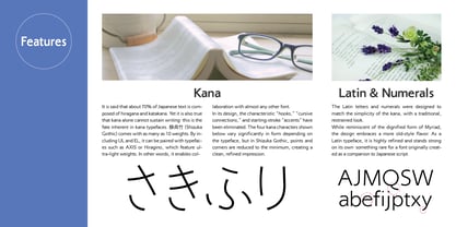
In Japanese text, kana characters account for roughly 70% of the total. Even so, kana fonts have little significance on their own; it is only when combined with kanji that they take on “meaning” and come to life.
Most vendors offer font weights in seven to nine variations, from “Light” to “Ultra,” but there are no universal standards for these weight categories — each vendor defines them differently. As a result, a “Light” weight from one vendor may differ subtly in thickness from another. For kana fonts to pair harmoniously with such variations and truly come alive, a finer gradation of weights is essential.
This is why our kana fonts feature such detailed weight variations.
Simply changing the kana can greatly enrich the expression of a typeface.
We hope you will make the most of our kana fonts, blending them freely with other typefaces to create combinations that perfectly suit your taste.
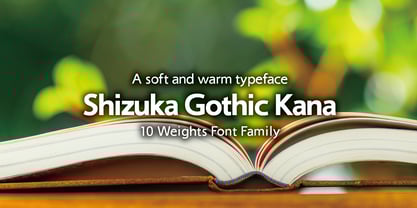
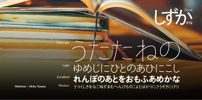
A Warm and Gentle Typeface
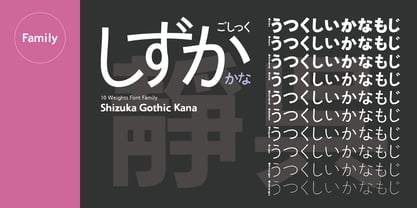
Shizuka Gothic Kana 10-Weight Font Family
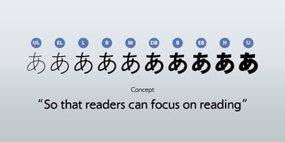
The 靜呉竹かな (Shizuka Gothic Kana) Kana family was developed with a single purpose: to let readers focus entirely on reading. Adding too many distinctive features to a typeface can sometimes get in the way of readability, so this design intentionally avoids that. The result is the ultimate “non-personality” typeface—Shizuka Gothic Kana.
It is based on slightly formal everyday handwriting, carefully refined into font form. In every way, it is the opposite of the dynamic “Seiren” style—hence the name 靜 (“quiet”) 呉竹 (Gochiku = Gothic). Decorative strokes such as hane (upward hooks) and renmen (connected strokes) have been minimized, and even the starting-point accents (serifs) have been removed.
Each stroke is drawn quietly and deliberately, with a commitment to a careful handwritten feel, resulting in forms that lean toward a beautiful traditional style. Ideal for body text, it will give your writing a warm, soft, and easy-to-read tone.
Both vertical and horizontal layouts feature proportional spacing, with additional pair kerning applied for horizontal writing (including Latin characters).