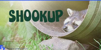
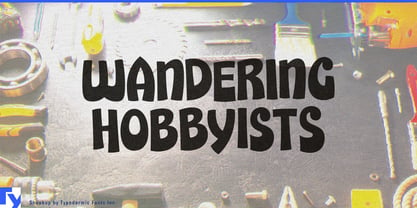
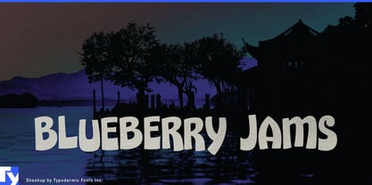
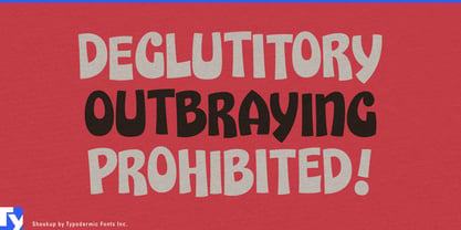
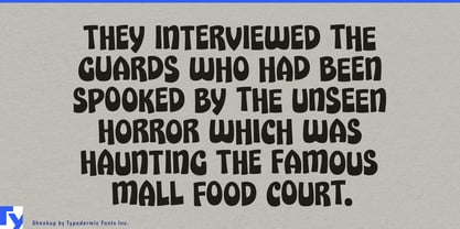
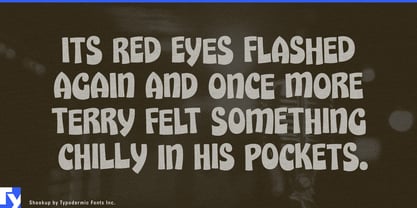
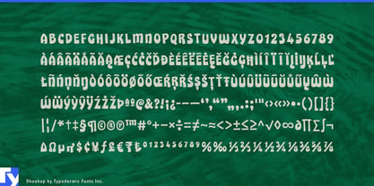
Kids’ brands need a little disorder. Custom cartoon lettering can provide it, but maintaining that energy across dozens of flavors, products, promotions, and seasonal variants becomes expensive and inconsistent. Ordinary fonts solve the system problem but can quickly start looking stamped out. Shookup lands between the two: chunky display lettering with automatic variation that keeps repeated letters and numerals moving instead of settling into a rigid pattern.
That makes Shookup especially useful for children’s food packaging. Breakfast cereal, fruit snacks, yogurt pouches, cereal bites, lunchbox crackers, cheese snacks, puffed snacks, snack bars, flavored popcorn, juice drinks, and other kid-focused products can use it for brand names, flavors, product variants, promotional bursts, and limited editions. The forms have enough cartoon energy to work beside mascots, bright illustration, strange snack shapes, and crowded supermarket graphics without requiring custom lettering for every SKU.
Better-for-you children’s food is another strong fit. A lower-sugar cereal, fruit snack, or lunchbox product may need to reassure parents, but it still has to look appealing to the child who is going to eat it. Shookup can carry the playful layer while calmer typography handles nutrition, ingredients, and parental information.
Fast-changing flavor systems also benefit from its shifting forms. Sour combinations, fruit mixes, seasonal cereal editions, novelty snack flavors, frozen assortments, and limited product drops can look fresh while remaining recognizably part of the same family.
Frozen treats bring out the same character. Ice pops, sherbet tubes, ice-cream sandwiches, mini cones, frozen yogurt snacks, sundae kits, and family multipacks can use Shookup for flavor names, assortment labels, and promotional graphics that need to feel energetic before the freezer door even opens.
Family-oriented quick-service restaurants offer a larger environment for the same visual language. Burger restaurants, pizza shops, taco concepts, hot-dog restaurants, chicken-finger chains, colorful breakfast concepts, and family diners can use Shookup for kids’ meals, combo names, shake flavors, menu headings, takeout packaging, merchandise, and seasonal promotions.
Shookup draws on the exuberant cereal-package lettering of the late 1960s and early 1970s, but its usefulness is contemporary. It gives large product systems a way to look shaken, rearranged, and redrawn while still behaving like a practical, repeatable font.
