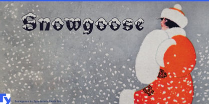
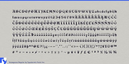
Some Christmas campaigns need more than a seasonal accent. They need the holiday to register before anyone has finished reading the headline. A custom snow treatment can handle one title, but the work multiplies across changing offers, product ranges, locations, personalized names and animated graphics. Snowgoose turns that exuberantly kitschy effect into a repeatable typographic system.
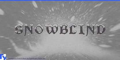
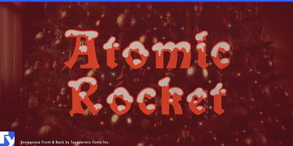
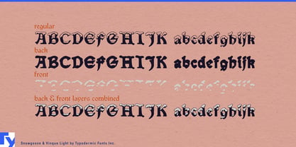
Regular provides the complete snow-capped treatment. Back isolates the solid blackletter body, while Front contains the snow covering. The separate layers let designers control each component’s color, finish and timing without rebuilding the effect for every phrase. The body can change with a product range while the snow remains consistent; the snow can appear, disappear or move independently while the wording stays in place.
That structure is useful for department stores, supermarket groups, toy retailers and consumer brands building one Christmas identity across window displays, gift guides, aisle signs, digital advertising, packaging, social templates and in-store screens. Snowgoose keeps changing copy recognizably part of the same campaign, even when departments, promotions or product lines use different palettes.
Seasonal confectionery offers an especially natural setting. Advent calendars, biscuit tins, gingerbread kits, chocolate assortments, bakery cartons and hot-chocolate collections benefit from lettering that makes Christmas unmistakable at a glance. Front can suggest snow, icing, sugar or frosting, while Back follows the color of each flavor or package. The components can also separate white ink, metallic ink, glitter, raised varnish or another finish from the main lettering.
Personalized ornaments, stockings, gift sacks, labels and confectionery boxes create a more demanding version of the same problem: every order may contain different text. Snowgoose gives changing names a consistent illustrated treatment without asking a lettering artist to draw fresh snow each time.
For television packages, streaming promotions and live entertainment, the layers provide distinct elements for motion. Snow can settle onto the title after the body appears, reveal separately or shift between flat and dimensional treatments. In Christmas villages, illuminated trails, department-store Santa experiences and seasonal railway events, Back and Front can become separate vinyl colors, stacked acrylic pieces, illuminated elements or projected overlays.
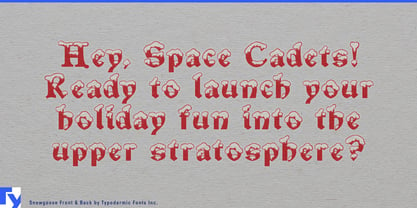
Snowgoose makes no attempt to turn Christmas into restrained winter minimalism. Its blackletter body and heavy snow caps belong to glowing shop windows, television specials, overflowing gift displays and theatrical family attractions. The separate snow layer turns that deliberate kitsch from a single novelty headline into a flexible system for campaigns with plenty of changing copy.