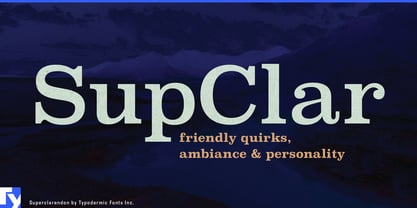
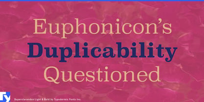
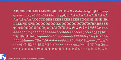
Many brand serifs are chosen for one glamorous word and abandoned when the explaining begins. The logo gets character; product descriptions, interviews, recipes and care guides fall back to an anonymous sans. Superclarendon is built to stay in the system. Its broad forms give names and headlines substantial presence, while its clear lowercase carries the editorial layer beneath them.
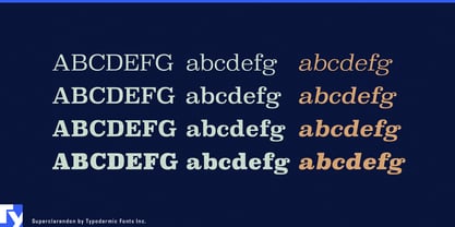
Superclarendon takes the familiar solidity of a Clarendon and pushes it toward a cleaner, more expansive construction. Substantial bracketed slabs create weight and stability; subtly squared curves keep the design from becoming quaint or excessively traditional. The historical flavor remains available, but it does not dictate sepia paper, distressed printing or period styling. Superclarendon sits comfortably beside bright color, contemporary photography, motion graphics and modern interface typography.
That range suits consumer brands that increasingly behave like publishers. A pantry company may need a package name, ingredient story, recipe card and producer interview. A cookware maker may publish care instructions, technique guides and product comparisons. Outdoor and home-goods companies create repair pages, owner stories, printed inserts and ecommerce features. Superclarendon can connect the product name with the material surrounding it across cartons, labels, campaign headlines, pull quotes and short editorial passages.
Cultural media creates a similar hierarchy problem. Documentary series, interview platforms, podcasts, museum programs and cultural magazines need typography for title cards, episode names, quotations, introductions and explanatory copy. A high-contrast serif can make the subject feel rarefied; a neutral sans can reduce it to generic streaming content. Superclarendon provides enough graphic mass for the title while remaining direct in the story that follows.
Its Clarendon character is still useful when history matters. Founding dates, anniversary editions, archive features, product retrospectives and reissue campaigns gain a sense of continuity without forcing the project into historical costume. Old-style numerals give dates, editions and timelines an additional layer of distinction.
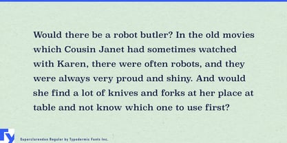
Superclarendon’s width wants room. It is strongest in mastheads, product names, feature openings, captions, pull quotes and short-to-medium passages rather than compressed legal copy or dense interface text. A quieter companion sans can handle navigation, specifications and compact data while Superclarendon supplies the editorial character shared across the rest of the system.