Skip to content
Skip to main content

Superego™

by Typodermic
Individual Styles from $69.95 USD
The Superego Font Family was designed by Ray Larabie and published by Typodermic. Superego contains 1 styles. More about this family

About the family


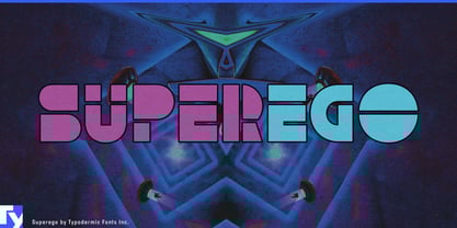
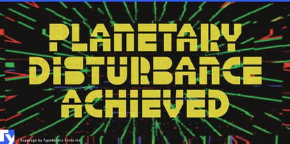
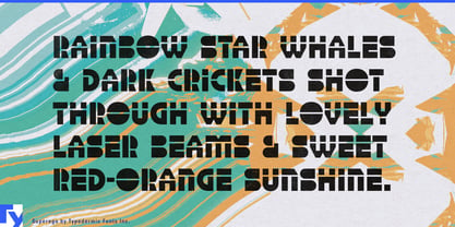
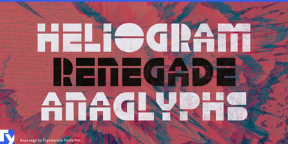
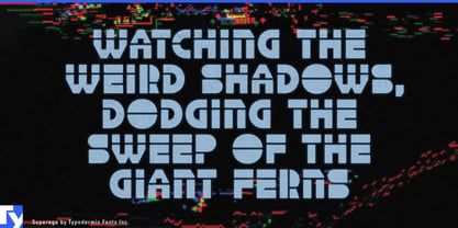
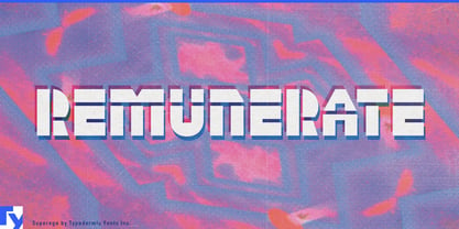
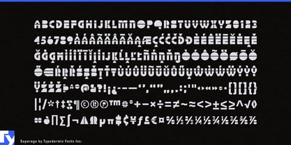
Futuristic display type often relies on grids, circuitry, segmented displays or hard rectangles. Superego takes a less obvious route. Its letterforms are assembled from circles, arcs, wedges, bars and other elementary geometric parts, recombined until familiar letters become strange again.

That makes Superego a natural fit for 3D modeling and digital fabrication, where simple primitives are routinely combined into more complex forms. CAD workshops, 3D-printing exhibitions, generative-design events and fabrication labs can use it for titles and product names that share the visual logic of the work itself.

Modular robotics and construction systems extend the idea into physical products. Educational robots, coding kits, mechanical construction sets and interchangeable electronics can use Superego for kit names, module families and STEM graphics without falling back on conventional rectilinear techno lettering.

The alphabet is also unusually suited to motion. Because the letters appear to be built from identifiable pieces, arcs can rotate, bars can slide, wedges can separate and whole words can collapse back into component shapes. Exhibition openers, product launches and motion identities can let the typography and surrounding graphics grow from the same kit of parts.

Geometry exhibitions, spatial-learning projects and shape-based games offer another natural territory. Superego works best where complexity emerges from simple forms; 3D modeling, digital fabrication, modular robotics, motion graphics and spatial systems all give its primitive geometry a reason to become unfamiliar.

Designers: Ray Larabie

Foundry: Typodermic

Original Foundry: Typodermic

MyFonts debut: Sep 20, 2012

Superego™ is a trademark of Typodermic.

About Typodermic

Welcome to Typodermic Fonts, a spirited type foundry rooted in Nagoya, Japan, started by the Canadian typeface designer, Raymond Larabie in 2001. Our library brims with 500+ diverse typefaces to fuel creativity in graphic design, advertising, web, and app development. As digital type pioneers, we adopted web fonts and app licensing early, consistently pushing the design envelope. With Canadian heart and Japanese precision, we're your global partners in extraordinary typography. Explore Typodermic Fonts—where creativity meets character.

Read more

Read less
