About the family
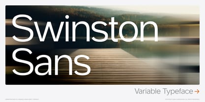
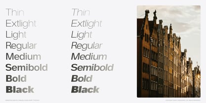
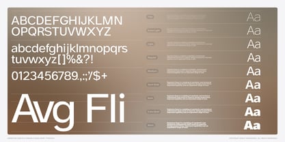
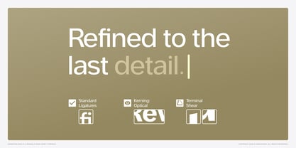
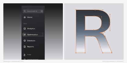
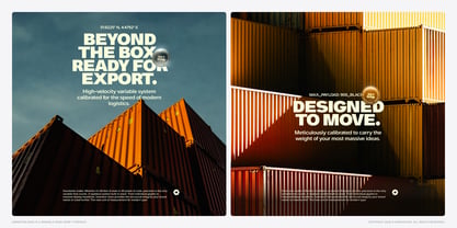
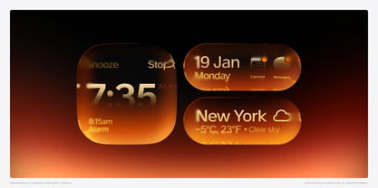
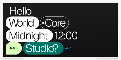
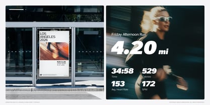
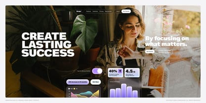
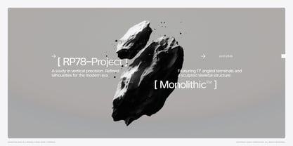
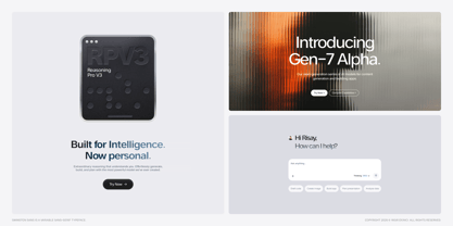
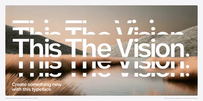
Swinston Sans — Variable Typeface The Typeface That Translates In a digital landscape drowning in neutrality, how do you design a typeface that feels engineered enough for code, yet human enough for conversation? For the last decade, sans-serif typography has been dominated by invisibility. Fonts like Inter, Helvetica Now, and countless Neo-Grotesques have become the default language of digital design. They're competent. They're safe. They're everywhere. But as we enter the era of generative AI, spatial computing, and hyper-personalised digital experiences, "neutral" is no longer enough. We don't need fonts that disappear. We need fonts that translate. This is where Swinston Sans begins. Origin Story: Three European Cities Rotterdam — The Grid The origin of Swinston Sans was found on a rainy Tuesday morning at a tram stop in Rotterdam. I became obsessed with the destination blinds of the RET tram lines—those stark, high-contrast signs that cut through grey fog to tell you exactly where you're going. Line E to Leidschenveen. Line 4 to Molenlaan. There's a specific beauty in these signs. They don't shout; they direct. They're designed for "glanceability"—to be read in milliseconds by passengers in motion. This is the DNA of Swinston Sans: wayfinding logic applied to digital branding. Amsterdam — The Lean If Rotterdam provided the upright skeleton, Amsterdam's famous "dancing houses" inspired the italics. These canal houses don't just stand—they lean. Historians call this "op vlucht" (on flight), a deliberate architectural choice. Swinston Sans Italic doesn't just slant—it leans with intention. Every curve was drawn to feel like those canal houses: slightly precarious, undeniably alive, unmistakably purposeful. Lisbon — The Density Lisbon taught me about working in tight spaces. Watching the iconic yellow Tram 28 squeeze through impossibly narrow streets, I engineered Swinston to thrive in density. Generous x-height, open apertures, carefully balanced counters—this typeface remains legible at 8pt on a smartwatch, yet commands attention at 120pt on a billboard. A Shapeshifter Built for the Variable Age Swinston Sans isn't just a font family—it's a variable typeface system designed to stretch, compress, and transform across infinite possibilities. By manipulating its variable weight axis (from Thin to Black) and slant axis (from Roman to Italic), the typeface morphs from functional utility into expressive display typography. One moment, it's the best font for AI startups presenting complex data dashboards. Next, it's setting luxury editorial spreads. Then it transforms into bold, kinetic display type for music festivals or streetwear brands. This versatility isn't accidental. It's engineered. Every weight, every variation, every optical adjustment was crafted to solve real design problems across digital and print applications. Technical Specifications • Variable Font Technology Full variable font with comprehensive weight axis (100–900) and slant axis (0–12°), giving you infinite typographic control within those parameters. • Character Set Extended Latin with full diacritical support for 200+ languages, ensuring true global reach for your projects. • OpenType Features Stylistic alternates, tabular figures for perfect alignment, true-drawn fractions, properly designed superscript and subscript characters. • Screen Optimisation Meticulously optimised for digital rendering with careful hinting and optical adjustments that ensure clarity across all contexts, from retina displays to standard resolution monitors. • Design System Ready Integrates seamlessly into modern design and engineering pipelines. Perfect for design systems, brand guidelines, and design tokens. Perfect For • Tech & Startups UI/UX design, dashboard interfaces, SaaS products, fintech applications, data visualisation, mobile apps • Branding & Identity Corporate identity systems, brand guidelines, presentation decks, marketing materials, packaging design • Editorial & Publishing Magazine layouts, editorial design, book typography, digital publishing, blog design • Web & Digital Website design, web applications, responsive interfaces, email templates, social media graphics • Display & Advertising Posters, billboards, environmental graphics, signage systems, advertising campaigns Why Swinston Sans? • Unmatched Versatility — One variable font that genuinely replaces dozens of static fonts in your library, eliminating weight bloat and licensing complexity while giving you infinite precision. • European Design Heritage — Inspired by Rotterdam's clarity, Amsterdam's rhythm, and Lisbon's vitality. This isn't typeface design by algorithm—it's rooted in actual places and lived experience. • Future-Proof Technology — Built with tomorrow's design systems and spatial computing in mind, ready for contexts we can't quite imagine yet but know are coming. • Screen Optimised — Engineered for digital interfaces first, but this optimisation doesn't come at the expense of print performance. • Distinctive Yet Functional — Brings genuine personality and memorability without compromising the usability and legibility that professional work demands. • In a world where every startup defaults to Inter, every app borrows from San Francisco, and every website reaches for Roboto—Swinston Sans is how you stand apart. Who Is This For? Swinston Sans is for designers who refuse to compromise. It's for the UI/UX designer tired of using the same Google Fonts alternatives as everyone else. It's for the brand designer searching for a geometric sans serif with actual soul. It's for the digital product team that needs a web-safe font that doesn't look web-safe. It's for the editorial art director who wants a clean modern font that isn't clinically sterile. If you've been hunting for the best typeface for startups, a professional sans serif font for your design system, or simply a high-quality font that brings something genuinely fresh to digital typography—this is it. Swinston Sans is for those who understand that in an age of AI-generated everything, distinctive typography is your competitive advantage.
Swinston Sans
About yasireknc
Yasir Ekinci is a multidisciplinary designer based in Edinburgh, Scotland, with a deep passion for typography. Recently completing a Master's in Science with a specialisation in human-computer interaction, Yasir excels at blending form and function to craft engaging user experiences. He believes that thoughtful design significantly enhances interactions between people and technology. In his personal projects, Yasir focuses on integrating elements that are not only aesthetically pleasing but also serve practical purposes, making his work both beautiful and functional.
Read more
Read less