Select this license type when you are developing an app for iOS, Android, or Windows Phone, and you will be embedding the font file in your mobile application's code.
Taberna
by Latinotype
Individual Styles from $0.00
Complete family of 22 fonts: $189.00

Taberna Font Family was
designed by
Jorge Cisterna,
Rodrigo Fuenzalida and
published by
Latinotype. Taberna contains
22
styles and family package options.
More about this family
- Aa Glyphs
-
Best ValueFamily Packages
- Individual Styles
- Tech Specs
- Licensing
About Taberna Font Family
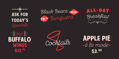
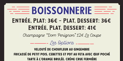
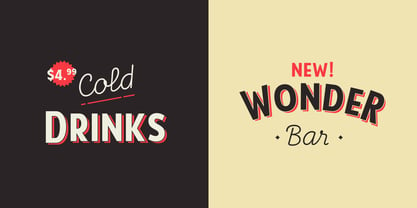
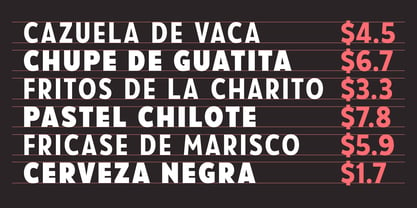
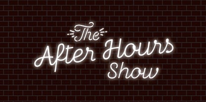
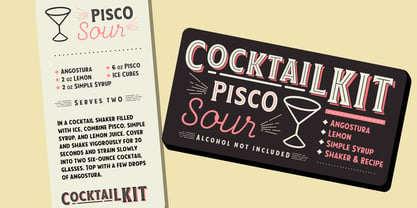
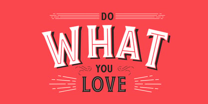
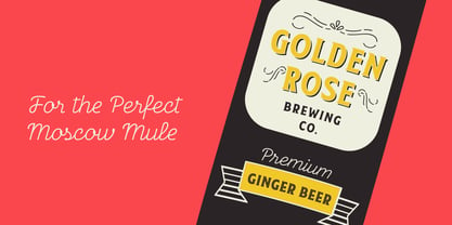
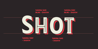
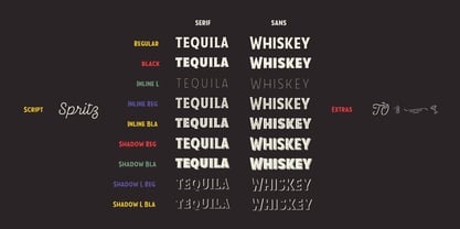
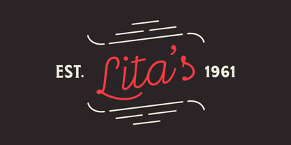
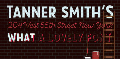
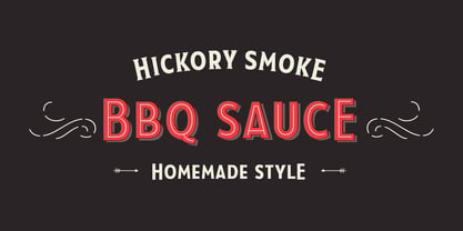
Taberna is a type system that provides a wide range of choices for any design project. The typeface comes in Sans and Serif layered versions plus a monolinear Script font. Taberna is the result of having explored design trends in bar signage, liquor packaging and street wear. Taberna is a funny display font with a Sans version—that provides a more clean and simple design—and a Serif one, which gives text a more distinctive and sombre personality. The Script version matches perfectly with the heavy Caps of the typeface. Taberna is a very versatile font well-suited for headlines, posters, logotypes, etc.
Designers: Jorge Cisterna, Rodrigo Fuenzalida
Publisher: Latinotype
Foundry: Latinotype
Design Owner: Latinotype
MyFonts debut: Nov 22, 2016
Taberna

About Latinotype
Based in Concepción and Santiago, Chile, Latinotype’s founders say, “Our goal is to design new typefaces remixing diverse influences related to our South American identity with high quality products for the contemporary design industry.” And the duo have been doing just that since their foundry’s creation in 2007. One of the most successful foundries on MyFonts in recent years, Luciano Vergara and Daniel Hernández, have put together a rapidly growing collection of typefaces in a wide array of genres. Specializing in colorful display and script faces, the group’s name “Latinotype” emphasizes the strong tie they feel to their cultural identity. The Premium foundry page can be viewed Here.
Read more
Read less
- Choosing a selection results in a full page refresh.