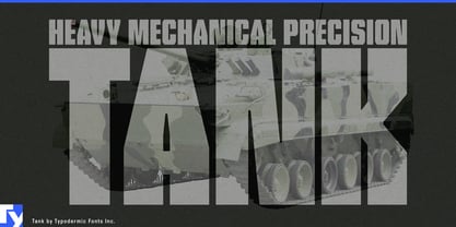
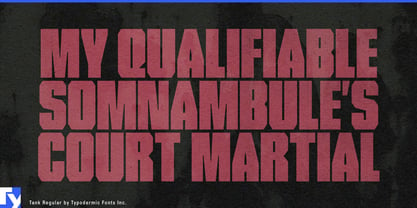
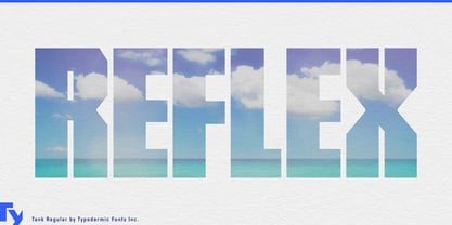
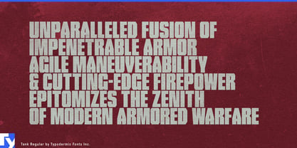
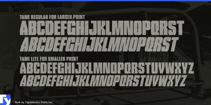
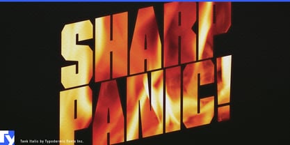
Large campaigns often need two things at once: oversized typography and rich imagery. Put the headline over the photograph and it starts obscuring the subject; push the image behind the letters and the typography can lose impact. Tank approaches the problem differently. Its massive all-caps forms were designed with generous internal spaces that can become containers for photography, material textures and, in motion graphics, moving footage. The headline can carry the visual content instead of merely sitting on top of it.
That makes Tank particularly useful for professional sports campaigns. Season launches, roster introductions, jersey reveals, rivalry weeks, playoff graphics and athlete announcements all have to combine names, faces, uniforms and team imagery across arena screens, concourse displays, outdoor advertising and social video. Tank can hold player portraits, crowd footage, city imagery or uniform details inside a short team name or campaign phrase while maintaining a strong outer silhouette.
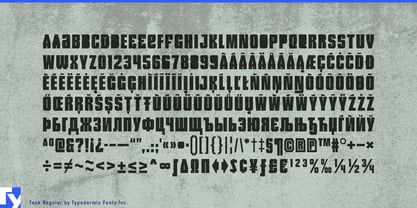
Its alternate closed-counter forms expand that possibility. Where an ordinary counter would interrupt an important face, product detail or moving image, the more continuous alternate can provide a larger uninterrupted visual field. The regular letterform remains available when conventional structure matters more.
Arena tours, concert residencies and large-format live entertainment create a similar problem. Tour names and artist titles may need to occupy stage LED walls, arena ribbons, venue façades and promotional films without simply covering the performance imagery behind them. Tank can turn those titles into apertures for artist close-ups, crowd footage, lighting effects and live-camera material while the outer typography stays consistent.
Streaming, film and factual entertainment can use the same approach for ensemble-driven key art. Sports documentaries, competition series, action ensembles and reality formats often have too many faces, locations or narrative elements competing for poster space. Tank lets part of that visual material move inside the title itself, keeping the lettering monumental while freeing the rest of the composition.
Material-led product campaigns offer another strong role. Performance footwear, technical apparel, carbon-composite bicycles, automotive interiors, architectural surfaces and advanced textiles are often sold through close-ups of what they are made from. Engineered knit can run through a shoe-series title; carbon weave can fill a bicycle-component name; terrazzo, recycled composite or acoustic textile can occupy an architectural-material heading.
Tank works best for short names, large headings and display graphics where the letters are big enough for their interiors to become useful visual space. Pair it with a quieter companion face for schedules, specifications and explanatory copy, and let Tank handle the moment when the headline and the image need to become the same thing.