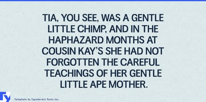
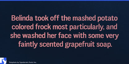
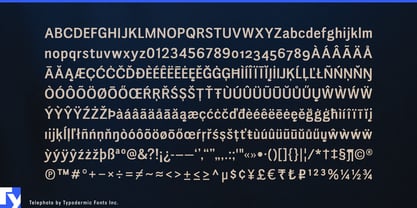
Old material creates a particular typographic problem. A clean contemporary font can look conspicuously new beside scanned photographs, newspaper clippings, contact sheets, tickets, reports, and other archival sources; a heavily distressed font can make everything look artificially damaged. Telephoto occupies the useful space between those extremes. Its early-grotesque structure remains clear and readable, while softened reproduction, slight irregularity, and subtle variation make the lettering feel as though it has already passed through an imperfect printing or photographic process.
That makes Telephoto particularly useful for documentary film and factual television. Historical series about politics, crime, sport, music, technology, business, or social history continually need new typography to coexist with material from the archive. Telephoto can handle chapter cards, dates and locations, photograph captions, timeline entries, dossier headings, map annotations, and reconstructed documentary graphics without turning the past into a theatrical vintage effect.
Museums and exhibitions face the same problem at a larger scale. Industrial-history galleries, transportation museums, photography retrospectives, labor-history exhibitions, broadcasting archives, and social-history shows often need two typographic voices: a contemporary one for navigation and curatorial information, and another for material belonging to the historical record. Telephoto can distinguish archival captions, quotations, timeline material, interactive archive stations, and catalog sections while remaining readable enough for more than a decorative headline.
Corporate heritage programs provide another strong role. Railways, airlines, manufacturers, broadcasters, newspapers, automotive companies, engineering firms, and long-established consumer brands regularly produce centenary exhibitions, retrospective books, archive websites, headquarters installations, and historical timelines. Telephoto can supply the past-tense layer: factory locations, old product names, historical dates, employee quotations, and archive captions can share a consistent printed character while the company’s regular typeface handles the present.
Photography archives, sports retrospectives, and music reissues benefit from the same distinction. Contact sheets, negatives, old programs, ticket stubs, studio paperwork, newspaper clippings, and publicity photographs can sit beside newly typeset captions, catalog numbers, chronology, statistics, session dates, and archival quotations without an abrupt change of texture. Telephoto is typography for material retrieved from the archive but still needing to be typeset today.