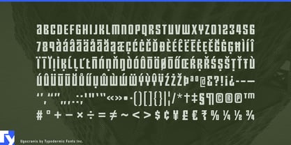
Some projects do not need typography that promises excitement. A recycling plant, district-heating station, freight terminal, or municipal utility building may contain sophisticated technology, but sleek startup typography can feel strangely dishonest. Traditional industrial lettering creates a different problem: military stencils, heritage machinery, and rugged nostalgia can make new infrastructure look inherited from another era.
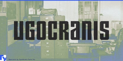
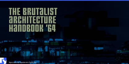
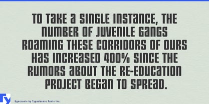
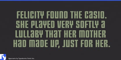
Ugocranis makes plainness intentional. Its narrow all-caps forms, uniform strokes, compact octagonal construction, and somber rhythm create a distinctly administrative kind of display lettering. There is enough geometry to keep it recognizable, but very little theatricality. It looks suited to organizations that operate facilities, process materials, move freight, and maintain systems rather than sell an imagined future.
Advanced recycling and material recovery are especially strong settings. Robotic sorting lines, battery-recovery plants, e-waste dismantling centers, critical-material processing, and automated recycling systems combine sophisticated technology with unapologetically industrial environments. Ugocranis can handle facility names, processing-zone headings, material-stream graphics, sorting-line identities, plant feature walls, and construction hoardings without making a recycling facility look like a consumer-electronics launch.
District heating and urban thermal infrastructure provide another natural fit. Large heat pumps, thermal-storage systems, energy centers, pumping stations, heat-exchanger facilities, and recovered-heat networks increasingly form part of city infrastructure. Ugocranis gives energy-center names, district-network projects, plant-wall lettering, public exhibition headings, and engineering graphics a civic, operational character.
Automated warehouses and freight terminals offer a similar environment at enormous scale. Fulfillment centers, cross-dock facilities, automated sorting halls, container terminals, and logistics campuses need names and zone headings that can occupy large industrial surfaces without turning every building into a technology showcase. Ugocranis suits loading-hall graphics, maintenance-area names, facility lettering, and distribution-center identities where the typography should feel systematic rather than promotional.
Public works broaden that role into water-reclamation plants, stormwater facilities, pumping stations, utility compounds, tunnel-service buildings, maintenance depots, and infrastructure operations centers. Remanufacturing and reverse logistics add EV battery refurbishment, industrial component recovery, electronics reuse, and parts-recovery operations.
Ugocranis also works well for bureaucratic world-building. Fictional ministries, housing authorities, state utilities, processing centers, records divisions, institutional corridors, and industrial colonies often need typography that looks standardized rather than spectacular.
Ugocranis is most useful when dullness itself is part of the message: infrastructure, utilities, processing facilities, and institutions whose credibility comes from appearing permanent, impersonal, and more concerned with getting the job done than looking exciting.