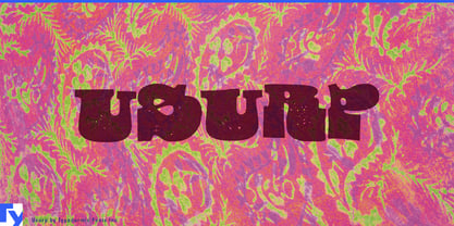
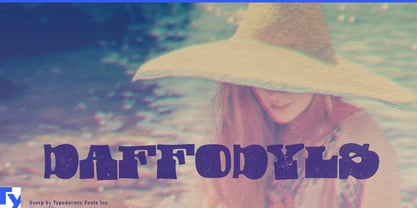
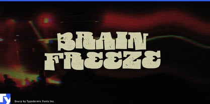
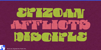
Handmade typography often comes with baggage. It can suggest rustic craft, casual friendliness, scrapbook textures, or carefully manufactured imperfection. Usurp takes a different route. Its letters were physically cut from paper with scissors, assembled into words, scanned, and refined; the irregularity comes from construction rather than an effect applied afterward. The result is handmade without being quaint.
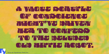
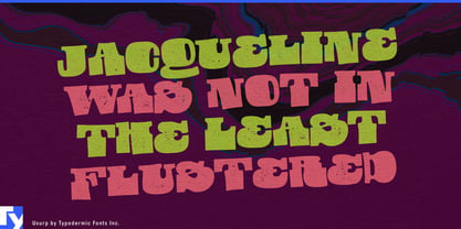
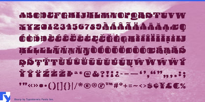
Usurp is heavy, crowded, and deliberately strange. Thick slab-like forms collide with distorted proportions, awkward counters, and abrupt changes of width, giving short words unusually distinctive silhouettes. At large sizes the individual letters can feel less like conventional type and more like a collection of cut shapes forced into an alphabet. There is a psychedelic quality to the results, but it comes through physical form rather than the familiar vocabulary of swirling curves and retro decoration.
That makes Usurp particularly useful for consumer packaging that needs to own the front of the pack. Confectionery, ice cream, hot sauces, snack foods, craft soft drinks, flavour-led product ranges, and more countercultural botanical brands can use it for brand names, flavour names, limited editions, and oversized campaign phrases. A quieter companion typeface can handle ingredients, descriptions, and regulatory information while Usurp does the conspicuous work.
Product families are an especially good setting. Different flavour names produce dramatically different word shapes, yet the same chunky construction keeps the range recognizably related. Across cartons, wrappers, tubs, cans, point-of-sale graphics, and launch campaigns, Usurp can provide the visual constant without making every package mechanically identical.
Entertainment branding offers another natural role. Animated comedy, surreal television, eccentric family entertainment, theatrical campaigns, streaming key art, and themed attractions often need a title treatment that can establish the tone before an image is even introduced. Usurp can make a short title look physically constructed, unstable, and slightly unruly while conventional typography handles credits, schedules, descriptions, and supporting information.
Usurp is not intended to disappear into a layout. Its dense forms and distorted rhythm are best reserved for short phrases, names, and prominent display work where immediate character matters more than quiet reading. It can sit inside an otherwise polished commercial identity and provide the part that feels touched, cut, rearranged, and slightly out of control.