Select this license type when you are developing an app for iOS, Android, or Windows Phone, and you will be embedding the font file in your mobile application's code.
Visoko
by Mostardesign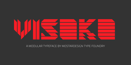
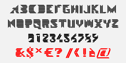

- Aa Glyphs
-
Best ValueFamily Packages
- Individual Styles
- Tech Specs
- Licensing
Per style:
$8.75
Pack of 4 styles:
$35.00
About Visoko Font Family
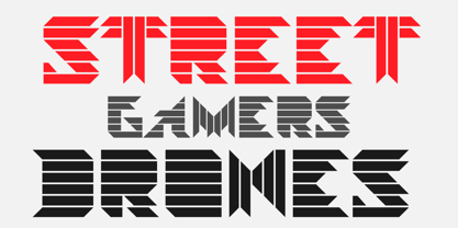
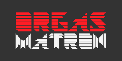
Visoko is a playful, geometric typeface inspired by post-modern fonts designed by Mecanorma from the 80s. This typeface has been designed on a grid of 7×6 squares but the goal was to create variations from the grid to give the character a destructured aspect. VISOKO is available in two styles : regular and italic and only in uppercase. It has aspects of Laser shapes and proportions but has modern additions that make it ideal for industrial brands and modern titles.
Designers: Olivier Gourvat
Publisher: Mostardesign
Foundry: Mostardesign
Design Owner: Mostardesign
MyFonts debut: Oct 14, 2009
About Mostardesign
It was in the year 2004 that graphic designer Olivier Gourvat began experimenting with type design for use in his graphic design studio, Mostardesign Studio. With a focus on brand creation, custom type, illustration and advertising, his studio has worked on a wide variety of projects in the last two decades for clients across the world.With the creation of his first font, Visoko in 2009, Olivier’s focus shifted primarily to type design. “I use my work experience and my knowledge in the graphic design process to create unique and professional fonts to help designers and web designers create an effective communication for their projects,” he says. And it is with his past as a graphic designer in mind that he creates versatile type families like Sofia Pro, one of his best selling fonts to date."I consider that the versatility of a font is the first step on the way to the success of a good global communication,” Olivier says. “A large family with a lot of different weights will convey a strong message to its audience while being easy to use on various media, whether print or digital."
Read more
Read less
- Choosing a selection results in a full page refresh.