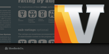
About Vitesse Font Family
Engineered for responsive handling and a sporty ride, Vitesse is confident and stylish in any situation.
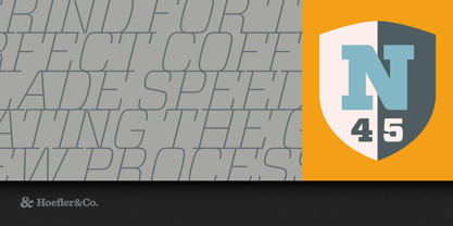
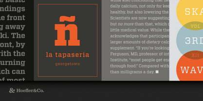
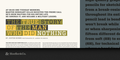
The Vitesse typeface was designed by Jonathan Hoefler in 2000. Unlike ‘geometric’ slab serifs based on the circle, or ‘antique’ ones based on the ellipse, the central motif of the Vitesse typeface is a soft-cornered barrel shape that affords opportunities for both long straightaways and quick turns. Initially a commission from Esquire, in whose pages the typeface first appeared in 2000, Vitesse was expanded into a larger family for Wired magazine in 2006, and supplemented by a companion sans serif, Forza.
From the desk of the designer:
Many of the typefaces we know the best, and use the most, are those whose foundations are centuries old. The typographic models that have survived the longest are those that have proven most adaptable: the Antique species of slab serif may be two hundred years old, but its formula is flexible enough to allow constant reinterpretation. Our Sentinel typeface was based on this nineteenth century genre, just as our Archer typeface was based on a twentieth century invention, the Geometric slab serif. Both are vibrant and living models, yet they invite a third option: the twenty-first century slab serif.
Our exploration into new kinds of slab serif began with a study of slab serifs past. Noting that nineteenth century designs were based on the ellipse, and twentieth century ones on the circle, we wondered what other geometries might prove similarly fertile, and were inexorably drawn to the rounded rectangle. Surprisingly, this attractive and familiar shape, so iconic of both the industrial and digital eras, has seldom been employed typographically as anything more than a novelty. There are customary ways of using rounded rectangles to look quaint, brutal, primitive, or faddish, but no obvious way to use them in the service of a more broadly expressive typeface. Since all rectilinear typefaces are ultimately a struggle between letterforms and their geometric underpinnings, our goal was to avoid either obvious endgame — rigidly conforming to the grid, or whimsically abandoning it — and to instead find a way to exploit this tension, turning it into gripping and energetic forms.
In developing Vitesse, we outlined the challenges that highly structured typefaces most often encounter. One test of whether a typeface’s recipe is too simple is whether it reduces the letters D and O to the same shape, an obvious (but common) blow to legibility. A typeface is too doctrinaire if it obliterates natural subtleties in the alphabet, such as the grace of the lowercase a, the gentle incline of the figure 5, or the ballet of curves that defines a well-balanced ampersand. A well-planned design program will prevent a font from becoming overgrown, and keep its handsome S and G from becoming lost in a thicket of serifs. And letters like the lowercase f, t, and r, whose compact profiles offer limited space for embellishment, must not become casualties to the design, but instead emerge as the font’s proudest moments.
Instead of using the rounded rectangle as a motif, the strategy we devised for Vitesse was to use a more sophisticated shape as its central theme: a modified rectangle with flat surfaces above and below, gently curved sides, and quick turns at the corners. The complexity of these ingredients allows Vitesse to escape the grid when necessary, helping to preserve both the natural poise of intricate letters, and the typeface’s personality throughout its complete range of styles. The design that emerged has many of the qualities of a beloved sports car: Vitesse is agile, steady, suave, confident, and stylish.
Vitesse®
is a registered trademark of The Hoefler Type Foundry, Inc.
About Hoefler & Co.
Famous for designing long-lived typefaces marked by high performance and high style, Hoefler&Co creates the fonts that give voice to the world’s foremost institutions, publications, causes, and brands. With a library of 1,500 fonts designed for print, web, office, and mobile fonts, Hoefler&Co is everywhere. Their typefaces shaped the presidential campaigns of Barack Obama and Joe Biden; they’re on the cornerstone of One World Trade Center and on every iPhone ever made. They serve brands from Delta Air Lines to Tiffany & Co., publications from Harper’s Bazaar to The New York Times, institutions such as the Guggenheim Museum, The Public Theater, and New York University, and non-profit organizations including the Natural Resources Defense Council, the Southern Poverty Law Center, and The Peconic Land Trust. The Premium foundry page can be viewed Here.
Read more
Read less