




Skip to content
Skip to main content

VLNL Reep

by VetteLetters
Individual Styles from $35.00 USD
Complete family of 2 fonts: $60.00 USD
The VLNL Reep Font Family was designed by Donald Beekman and published by VetteLetters. VLNL Reep contains 2 styles and family package options. More about this family

VLNL Reep Complete Family

2 fonts

Best Value!

Per Style:

$30.00 USD

Pack of 2 styles:

$60.00 USD

About the family


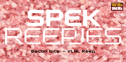
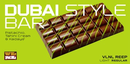
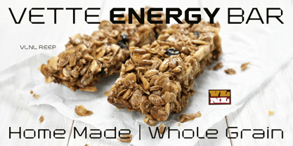
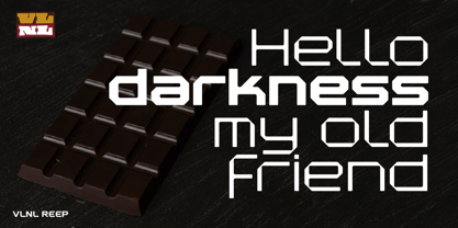
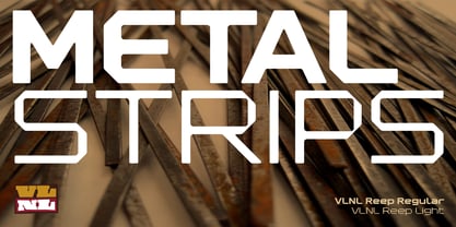
VLNL Reep is a bit of an anomaly. It is a grid based font built with only straight lines, smoothened with rounded corners. This makes its appearance softer and friendlier than most pixel-based fonts. It saw the light of day back in 2001 as the font for the Amsterdamse Popprijs 2002 band competition, and has since been used for a number of mainly music-related design projects.

While it is definitely rooted in the 1990s techno font boom, it also has a specific reference in the Dutch modernist 1960s and 1970s alphabets of Wim Crouwel and Jurriaan Schrofer. The lowercase r is even a direct reference to the 1968 logo design for Randstad employment agency by Ben Bos.

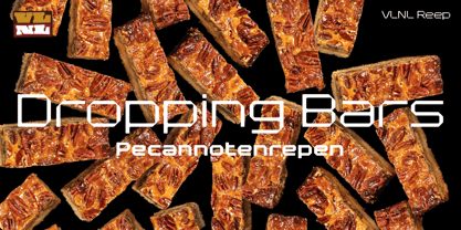
The name Reep means ‘strip’ or ‘bar’ in Dutch. With its robust and striking appearance, VLNL Reep is a versatile font that can be used in logo designs, flyers and posters, magazine headlines, and much more. VLNL Reep comes in two weights, Regular and Light.

Designers: Donald Beekman

Foundry: VetteLetters

MyFonts debut: Aug 1, 2026

VLNL Reep

About VetteLetters

Vette Letters, the most culinary fast food font foundry in the world, is fascinated by kebab shops, local chinese restaurants and fish-and-chips joints – not just the food but especially the shopfront typography. If all other type foundries are like haute cuisine restaurants, VetteLetters is the font-imbiss in the world of exclusive and expensive font foundries. Vette Letters tries to deliver high-quality fonts for an affordable price. VetteLetters is based in Amsterdam and run by two Donalds (Roos & Beekman. Vette Letters loves food and loves fonts.

Read more

Read less