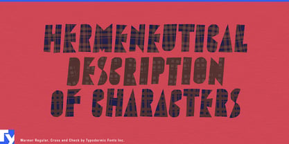
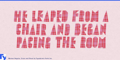
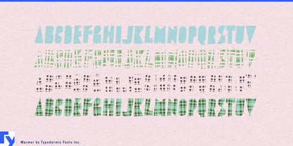
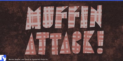
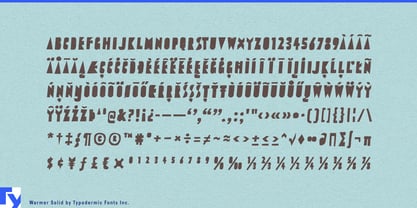
Plaid is easy to add to lettering and surprisingly hard to make convincing. Drop a check pattern inside an ordinary font and it often looks applied afterward, with the letters and textile having little to do with one another. Warmer takes a more integrated approach. Its Solid style supplies narrow, counterless display lettering; companion Cross and Check layers stack with it to build a woven pattern directly into the typography.
That makes Warmer especially useful for commercial textiles and interior collections. Upholstery manufacturers, contract-fabric companies, carpet and rug brands, wool blanket makers, acoustic-textile systems, and hospitality-fabric suppliers can use it for collection names, swatch-book covers, sample boxes, showroom walls, trade-fair graphics, product launches, and campaign headlines. Here the plaid is more than decoration; the typography participates in the same material language as the product being sold.
Apparel provides another natural setting, particularly autumn and winter collections built around checks, wool, flannel, and substantial fabrics. Overshirts, blanket jackets, wool coats, checked tailoring, scarves, heritage workwear, and plaid accessories can use Warmer for collection titles, shop windows, hangtags, shopping bags, lookbook covers, ecommerce campaigns, and limited-edition packaging. The Solid style can establish the broader identity while the layered versions turn the textile connection up when needed.
Mountain hospitality gives that material quality an environment of its own. Ski hotels, alpine resorts, mountain lodges, après-ski bars, winter restaurants, and cabin properties can use Warmer for seasonal campaigns, restaurant promotions, winter packages, resort merchandise, event graphics, and gift-shop products without relying on snowflakes, fir trees, or crossed skis to establish the mood.
The same logic works for outdoor and heritage soft goods such as wool overshirts, fleece, insulated vests, camp blankets, canvas bags, cold-weather accessories, and durable workwear. Seasonal retail and premium gift packaging are another strong fit: department-store winter campaigns, biscuit tins, cocoa collections, coffee gift sets, blanket-and-homeware promotions, and cold-weather subscription boxes can bring plaid directly into the typography instead of treating it as background decoration.
Warmer’s underlying alphabet grew from narrow, counterless lettering found on vintage Japanese rock-and-roll records, giving the Solid style a graphic life beyond textile effects. The layered construction lets designers move between simple display lettering and an integrated check pattern without changing typographic systems.