Hello, and welcome to the REN FONT foundry!
REN FONT has steadily built its reputation by repeatedly earning accolades in the Typeface category of the “Yearbook,” an exhibition organized by the Japan Typography Association (NPO). Founded in 2001 with the aim of bringing a fresh breeze to the font industry, REN FONT continues to create distinctive typefaces that stand out.
The hand-drawn-style fonts crafted by REN FONT’s type designer, Kazuo Kanai, have received high praise from professional designers and typographers for their exceptional quality.
A Message from Kazuo Kanai
With the exception of our comprehensive typeface Waon, our company has been particularly dedicated to producing kana fonts in the traditional Mincho and Gothic styles. Most of these fonts have been developed as multi-weight families — and there’s a good reason for that.
In Japanese text, kana characters account for roughly 70% of the total. Even so, kana fonts have little significance on their own; it is only when combined with kanji that they take on “meaning” and come to life.
Most vendors offer font weights in seven to nine variations, from “Light” to “Ultra,” but there are no universal standards for these weight categories — each vendor defines them differently. As a result, a “Light” weight from one vendor may differ subtly in thickness from another. For kana fonts to pair harmoniously with such variations and truly come alive, a finer gradation of weights is essential.
This is why our kana fonts feature such detailed weight variations.
Simply changing the kana can greatly enrich the expression of a typeface.
We hope you will make the most of our kana fonts, blending them freely with other typefaces to create combinations that perfectly suit your taste.
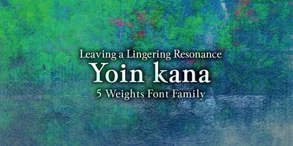
A Typeface That Leaves a Lasting Impression
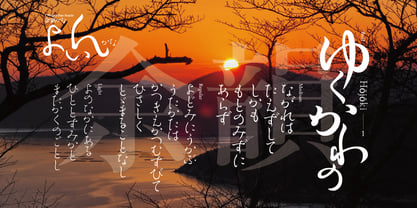
Yoin Kana 5-Weight Font Family
An expressive typeface with a lingering resonance.
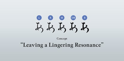
余韻かな (Yoin Kana) is a hybrid form that blends the refined elegance of Mincho with the flowing grace of semi-cursive script (gyōsho). Designed in pursuit of ultimate fluidity, its connected strokes emphasize brilliance and ornamentation. Yet, to avoid excessive busyness, connections are intentionally broken in areas where spacing would become too tight or too distant. Each curve is drawn with care, stroke by stroke, creating a typeface that, true to its name, leaves behind a deep and pleasant aftertaste.
Based on the natural handwriting of our type designer Kazuo Kanai, Yoin Kana incorporates the complex form imagery of both Mincho and semi-cursive styles. The family consists of five weights—Light (L), Regular (R), Medium (M), Demi-Bold (DB), and Bold (B). While it retains an old-style nuance, its large kana design is not bound by tradition, giving it a versatile character that adapts well to modern typesetting.
Capturing the Spirit and Movement of Dance
Each weight of the Yoin Kana family expresses the refined elegance of Japanese dance and the light, graceful rhythm of a waltz. Though many characters diverge from the orthodox Mincho form, great care has been taken to preserve both persuasive power and elegance.
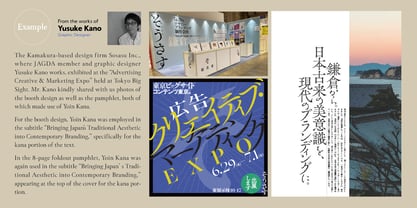
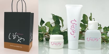
Because of its strong personality, the typeface is not suited for long passages of text. However, when used in short copy or as subheadings, it creates layouts full of vitality and impact. Proportional adjustments have been applied for both vertical and horizontal typesetting, along with carefully crafted pair-kerning.