Alphabet Tree - The Letter A
Welcome to the Alphabet Family Tree.
The fundamental purpose of writing is to convey ideas. Our ancestors, however, were designers long before they were writers. Their pictures, drawings, and arrangements, played a prominent role in communication from the very beginning.
The Alphabet Family Tree is about the history and design of the Latin alphabet. It describes how the monumental capitals (the alphabet inscribed on ancient Roman monuments and architecture) evolved from their earliest pictorial ancestors.
In each installment, you will also be treated to a little information about a typeface design, who’s name starts with the corresponding letter of the alphabet.
Read on, to find out more about the letter A and Avenir© Next.
No one knows why A is the first letter of our alphabet. Some think it’s because this letter represents one of the most common vowel sounds in ancient languages of the western hemisphere. Other sources, however, argue against this theory because the Phoenician alphabet, which is generally thought to be the basis of the one we use today, has no vowel sounds.
No one also knows why the A looks the way it does, but we can construct a fairly logical chain of events.
Some say the Phoenicians chose the head of an ox to represent the ‘A’ sound (for the Phoenicians, this was actually a glottal stop). The ox was a common, important animal to the Phoenicians. It was their main power source for heavy work. Oxen plowed the fields, harvested crops, and hauled food to market. Some sources also claim that the ox was often the main course at meals. A symbol for the ox would have been an important communication tool for the Phoenicians. It naturally follows that an ox symbol would be the first letter of the alphabet.

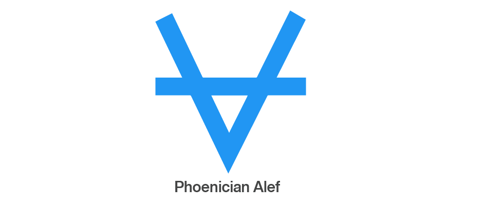
The Phoenicians first drew the ox head A as a V with a crossbar to distinguish the horns from the face. They called this letter “alef,” the Phoenician word for ox. Through centuries of writing (most of it quickly, with little care for maintaining detail) the alef evolved into a form that looked very different from the original ox head symbol. In fact, by the time it reached the Greeks in about 400 BC, it looked more like our modern k than an A.
The Greeks further changed the alef. First, they rotated it 90° so that it pointed up; then they made the crossbar a sloping stroke. The Greeks also changed the letter name from alef to alpha. Finally, they made the crossbar a horizontal stroke and the letter looked almost as it does today.

The Romans received the Greek alphabet by way of the Etruscan traders of what is now northern Italy. While the Romans kept the design, they again changed the name of the first letter–this time to ah. (The sound ay, our name for the A, was not common to the Latin language.)

The Roman capital letters have endured as the standard of proportion and dignity for almost 2,000 years. They’re also the basis of many of the lowercase designs. A is the first letter. There are 25 more stories.

Avenir® Next
When Adrian Frutiger designed Avenir®, his goal was more than just to add another minimalist sans serif to the pantheon of geometric designs. “As a starting point, I set myself the task of rendering more human circular shapes that had been drawn using compasses,” he explained. “I sat myself down in a small, quiet room and first drew an o contained within a perfect circle. Then I refined it, always with the goal of forming a readable curvature that was also easy on the eye.” The result is a letter that may look perfectly round, but is actually slightly flattened on top and bottom – a shape that creates a horizontal stress.
Frutiger incorporated this subtle foundational stress throughout the Avenir family. For example, the crossbar of the f and t, is just a little longer than other geometric sans and the down-strokes in characters like the A, K and V are minutely heavier than the up-stroke. Other characters, like the G, R, a and u, also have a foundation in traditional serif typefaces.
Avenir, perhaps the most inviting and readable of geometric typefaces, was released in 1988 in three weights – each with a roman and oblique version. Several years later, in 2004, Frutiger, in close cooperation with Akira Kobayashi, completely reworked the Avenir design, and added new weights to the family. The result is the Avenir Next family.

Download a pdf version of the Alphabet Tree - The Letter A manual.


