Alphabet Tree - The Letter C
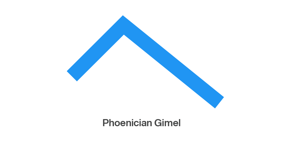
For much of their history, the C and G evolved as the same letter. The Phoenicians named this letter gimel, meaning “camel,” and used it to indicate the sound roughly equivalent to our present-day g. They drew the character with two quick diagonal strokes, creating something that looked like an upside-down V that is short on one side.
When the Greeks began to use the Phoenician gimel in their writing, they took liberties with the original design. First, the long arm was made vertical so that the letter resembled an upside-down capital L with the arm extending to the left. Then they reversed the letter so that the short stroke was on the right side. This design reversal was not uncommon with the Greek versions of Phoenician letters. The early Greeks wrote boustrophedonically, meaning “turning like oxen in plowing.” (Alternate lines were written in opposite directions.) In this technique, non-symmetrical letters were reversed in alternate lines of writing. By the sixth century BC, the style had been dropped in favor of the current practice of writing and reading from left to right, but by that time many letters were permanently inverted from their Phoenician design.
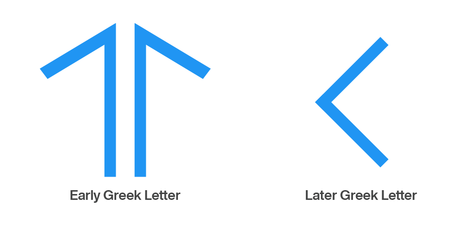
As with other Greek letters, the Romans softened the sharp angle and the form began to look like our present C.
The Romans used this letter to indicate both the hard (kay) and soft (gay) sounds. In time, however, they developed a graphic differentiation for the two sounds. The soft sound remained the C, while a barb was added to the bottom terminal to indicate the hard G sound. Thus, the gimel evolved into both the C and G.
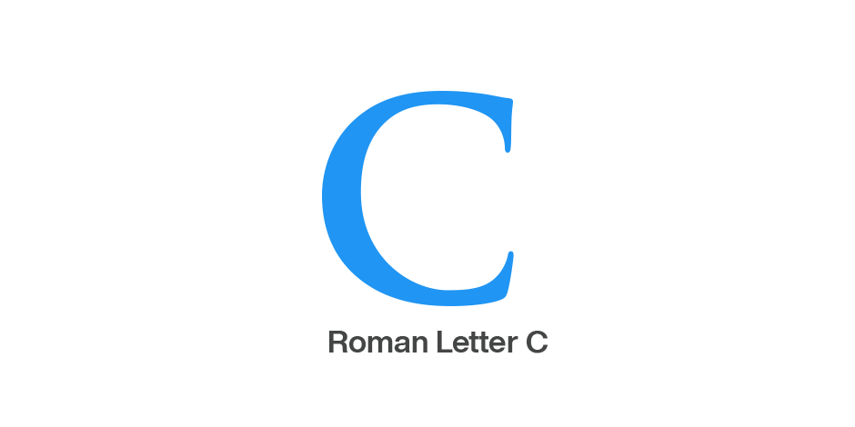
The C is not only the third letter of our alphabet, but it is also the first letter to share the same design for both capital and lowercase.

Cotford™
We asked Tom Foley, the designer of Cotford™, why he chose to design a seif typeface, when so many new releases are sans serif designs. “I got the sense,” he explained, “that serif fonts would make a comeback, and become more widely used in the design of digital products and branding. This coincided with the release and emergence of variable font technology, which offered an opportunity to leverage a new font format to create a serif typeface family designed to be flexible and adaptable. It felt like the right time to develop the ideas behind Cotford.
“The idea for Cotford™ was knocking around in my sketch book, and as digital drafts, for years. I decided to move forward with the design, when I saw, what I thought was, a saturation point in the use of sans serif fonts.”

Download a pdf version of the Alphabet Tree - The Letter C

