Alphabet Tree - The Letter D
Much of our alphabet is built on a representational concept called “acrophony”. Acrophony means indicating a sound through the use of a picture or name of something that begins with the same sound. Children’s alphabet books do this all the time; they might use a picture of a dog to represent the sound of the letter D.
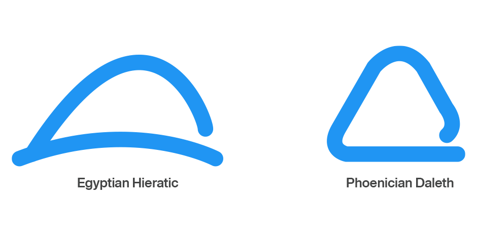
When the Egyptians used the symbol for a hand (their word “deret”) to indicate the sound value of D, it served its purpose adequately. However, when the Phoenicians adopted much of the Egyptian hieratic system of writing (a kind of abridged form of hieroglyphics), they didn’t know which objects many of the signs actually depicted. For example, it has been speculated that the symbol that represented a hand to the Egyptians looked like a drawing of a tent door to the Phoenicians. As a result, the Phoenicians called the character “daleth” – their word for “door.” Different object, same D sound.
The Greeks continued the acrophonic tradition, but rather blindly. Even without knowing the literal meanings of the symbols, the Greeks were content to adopt the Phoenician names (or something close to them) to represent the Greek versions of the same letterforms. Thus, the Phoenician “aleph” became “alpha,” “beth” became “beta,” and “daleth” evolved into “delta.”

Over time, the Phoenicians’ haphazard rendering of a door developed into the orderly, often symmetrical triangular Greek delta. Later in its evolutionary process, the triangular D was tipped to balance on one of its points. Still later, a rounded version of the basic shape came into use.

It was this softened version of the D that was adopted by the Etruscans, from whom the Romans borrowed their alphabet. The Romans further refined the D into the balanced and deceptively simple letter we use today

Dating back to the early 20th century, DIN is the original “industrial strength” sans. Its name is an acronym for the German Deutsches Institut für Normung (German Institute for Standardization), and it was first used to identify railroad cars. Although DIN was the standard typeface for highway signage, house numbers and engineering applications for decades, it was not used much by graphic designers until the late 1980s.
In 2014, Akira Kobayashi helped give this venerable sans new life in the form of the DIN Next family. According to Kobayashi, the idea was to improve the DIN family and make it more useful to graphic designers. “I knew that DIN Next had to be more ordered and flexible, have more weight variations, and include OpenType features.”
The DIN Next Slab design provides graphic communicators with a welcome addition the DIN Next family that complements the original sans serif and extends its usefulness and creative options. The light and medium weights perform remarkably well in continuous text while the heavier designs are commanding at large sizes with no loss in character legibility

Download a pdf version of the Alphabet Tree - The Letter D

