Alphabet Tree - The Letter E

As any Scrabble® player will tell you, e has always been an important letter in the English language. It’s used more often than any other.
In the early years of the Internet, the letter achieved near-ubiquitous popularity. Early on, it was tacked-on to almost any other word to imply the white heat of the new technological revolution. Terms like e-business, e-zine, e-cash, e-text and e-book were just a few of the new “e-“ words.
The forerunner of these compounds is the comparatively venerable e-mail, first used in the early 1960s. Email was recorded as a noun in 1982 and as a verb in 1987.
E-mail gained wider currency from the early nineties onward, but many new users of the term were uncertain whether the initial letter was an abbreviation or a prefix, and whether the word should be written with a hyphen or not. Hence the alternative forms e-mail, and email. The issue of the hyphen is still far from being settled. To this day, different style guides prefer one spelling over the other.
Flashback About Five Millennia to Ancient Egypt
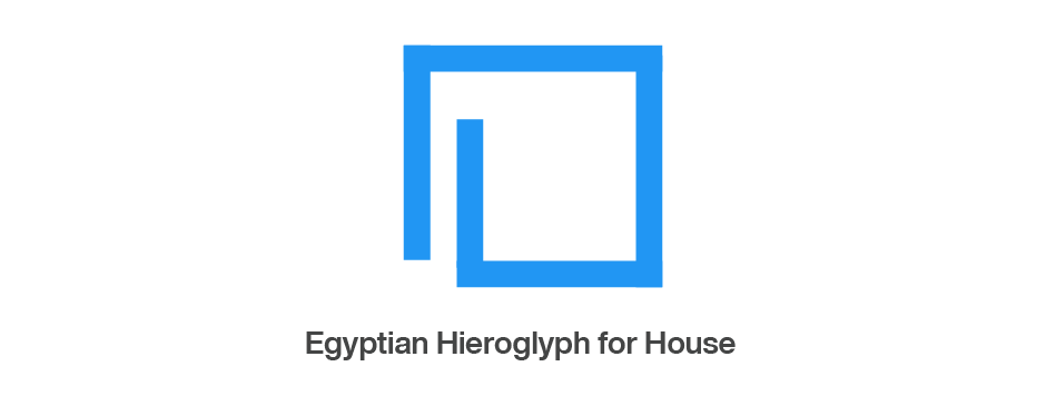
Many experts believe that the fifth letter of our alphabet – or, rather, some of the sounds it represents – was once indicated by the Egyptian hieroglyph for a house or courtyard.

Two thousand years later the hieroglyph evolved into the Phoenician letter called hé, which represented, roughly, the sound of our h.

From the Phoenicians to the Greeks
When the Greeks adopted the Phoenician writing system, they had difficulty using about half of the letters. Most of these troublesome characters were modified to bring them into sync with the Greek language. Some were altered slightly, others drastically. A couple were dropped altogether.


The Phoenician hé was one of the problem characters. The Greeks could not pronounce the first sound of the letter’s name. Being pragmatic people, and living in less complicated times, their solution was simply to drop the part of the name that caused the difficulty. As a result, the Phoenician hé became e, and our most useful vowel was born.
A Final Modification
Over time, the Greeks gradually simplified the design of the Phoenician character, and flopped it so that its arms were pointed to the right. The end result looked remarkably like the ‘E’ found in typefaces like Avenir® Next or Harmonia™ Sans. The final version was given the name epsilon and represented the short e sound (as in “bed”).


The foundation, of what was to become ITC Eras, was drawn by, French type designer, Albert Boton. In the early 1960s, he drew a single-weight, cap-only design, for the typesetting studio, Hollenstein Phototype, in France. Unfortunately, the minimalist typeface also enjoyed minimalist popularity.
Later, the single weight face was made available from Photo-Lettering Inc., in New York. Still, the design only enjoyed limited success. Boton, later, added a lowercase to the design, but it wasn’t until Aaron Burns, the co-founder of International Typeface Corporation (ITC), noticed the typeface design, around 1974, that things began to take-off for Eras. Burns encouraged Boton to enlarge the limited character complement and create additional weights, to create a more useful typeface family.
When released, as an ITC family of five weights, in 1976, ITC Eras was very different from most other sans serif designs of the time. It was not geometric, or precisely structured, and its proportions reflected Roman types rather than popular most sans serif designs, of the time.
ITC Eras also had a slightly angled, rather than vertical, stress and its sweeping strokes and compound curves owed more to the heritage of broad-tipped brushes than a ruling pen. ITC Eras quickly became one of ITC’s best-selling typefaces.


